If the kitchen is white
The white color of the countertop for a white kitchen is one of the most common options that can often be seen in the interior.
And it is no coincidence: this combination makes even a small room much more spacious, and significantly adds air to the atmosphere. Moreover, it is not at all necessary to follow the “tone on tone” rule: it will be enough if the shades of the working surface and facades are as close as possible to each other.
If you already have enough white and you don’t want to turn your kitchen into a blinding room, you can use the rule of contrast and make an accent countertop: graphite, black, dark brown.
A milky or white kitchen with a dark countertop will significantly diversify the color scheme, and the dark color will become a saving accent to restore balance.
How to choose the right kitchen countertop color
There are many different colors of kitchen countertops, so it is important to know how to choose the right shades to pair with the main elements. We suggest using the advice of professional designers:
- Focus on the color of the facades. There are two options: tone on tone with facades, in accordance with the color scheme of the lower/upper tier or individual modules. Finding the perfect “hit” is very difficult. This is due to the fact that the material used to make the facades and countertops is different, so its texture and, therefore, the visual perception of color are also different. Perhaps the only exception is white and black headsets - there are no difficulties with them. But remember that it is advisable to “dilute” such monochrome with bright accents, for example, a contrasting wall panel or one with an original pattern. If the colors of the facades of different tiers of the kitchen set are different, then choose a shade of the countertop to match one of them. This solution always looks harmonious and impressive.
- Make the apron a visual extension of the countertop. It is very simple to implement this option in practice; it is enough to use the same material for the manufacture of the working surface and the wall panel. And in this case, you won’t have to worry that a “conflict” will arise between the shades of the countertop and the apron. The “matching” elements of the headset look neat and complete. There is an alternative option: if the apron is lined with tiles or colorful artificial stone, you can complement it with a tabletop, the shade of which matches one of the colors used in the wall composition. Such a solution will look very non-trivial.
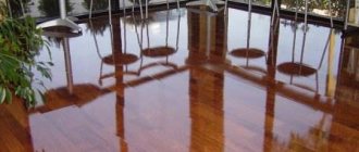
- Connect the flooring and countertop. Is there a parquet board on the floor? Then you can safely choose a countertop whose color imitates the same type of wood. Are you using porcelain stoneware or tiles for the floor? Then you should pay attention to countertops made of natural or artificial stone.
We suggest you familiarize yourself with How to sew a military uniform at home
- Involve a dining group in the interior design. A universal solution is to make the working surface of the kitchen set and the tabletop from the same material. Such combinations look very “easy”, but at the same time make the interior holistic. You can combine the shade of the work surface not only with the dining table top, but also with chairs, sofas, banquettes and any other pieces of furniture.
- Make simple decisions sophisticated. Plain countertops look laconic and strict, and to prevent them from looking “boring”, it is enough to choose materials that imitate natural stone. Light stains and inclusions will not be particularly noticeable at first glance, but upon closer examination they will pleasantly surprise you with their discreet but unusual design. There is one more advantage: on such working surfaces, not only crumbs and stains are less noticeable, but also mechanical damage, abrasions, and scratches that inevitably appear over time.
How to choose the color of the countertop for the kitchen set?
There are no rules governing the choice of countertop color. The main thing is that it does not seem superfluous and out of place in this kitchen. This means that the tabletop must be combined with the facades and the “apron”. To avoid mistakes, apply samples from the catalog of facades and countertops to each other. In order not to “try on” everything, you should decide in advance on the desired color scheme, and then the color selection process will go faster. There are many possible schemes, and each of them is good in its own way. There are no worse or better options - choose the one you like.
Nuances when choosing a color
Experts say that the color of the kitchen space and, in particular, the countertops should be chosen depending on how you want to feel when coming to the kitchen. To do this, you need to know a few nuances about choosing a color scheme: 1. If you want to feel calm and neutral in the kitchen, then the atmosphere should be created in blue and green tones. These are the natural colors of greenery and water, and people always feel comfortable in nature.
2. To create a warm atmosphere, you need to choose a beige or peach shade for the table if the kitchen windows face north.
3. Bright colors - orange or turquoise, will create an atmosphere of good mood and increase appetite before eating.
4. A light-colored countertop is perfect for a small space. It will visually increase the volume and will look good with cool colors of furniture, especially if the windows face south.
5. Warm yellow color makes the interior pleasant and immediately catches the eye, especially if the kitchen is chosen in darker colors.
6. The white color of the countertop creates a feeling of cleanliness and sterility. But this purity is quite difficult to maintain in its initial state. Therefore, the surrounding design is selected in a different color.
To understand which countertop is suitable for the kitchen, you need to think through the entire design of the room in advance - decide on wallpaper, flooring, kitchen furniture.
Tabletop-window sill
One of the most common ways to make optimal use of space in the kitchen is to convert an ordinary window sill into a dining table .
This is especially true in a small kitchen. Indeed, in this case you can completely get rid of a rather bulky dining table.
The height of the chairs for it is selected depending on the height of the window sill. Thus, a high window sill can turn into a kind of bar counter with high chairs that can easily be hidden under it or made folding.
The arrangement of a desktop instead of a window sill is also very convenient, because even in cloudy weather you can work near the window without additional artificial lighting until dusk.
Moreover, the length and shape of the desktop can be very diverse. Most often, the worktop-window sill is located along the entire wall. It can also be combined with one or two work areas located near the side walls.
In both options, it is extremely important to ensure sufficient air circulation around the heating battery, because in severe frosts the temperature of the coolant in the heating system sometimes reaches 95 degrees.
To do this, a special decorative grille is inserted into the tabletop, and the back wall of the floor cabinets must be at a distance of at least 10 cm from heating appliances and pipes.
High legs on bedside tables also promote the flow of cold air to the radiators, and they also allow you to notice a leak in the heating system in time.
General principles of selection
I would immediately like to formulate the main principle of choice, which applies not only to the tabletop, but to any interior detail in general - this is the absence of inappropriateness. That is, if, having chosen something, you have no idea how it will fit into the interior, do not take this thing, material, accessories, no matter how much you like this item.
Now let's figure out what principles should be followed when choosing a kitchen countertop.
- Decide on the style of your kitchen. Will it be a state-of-the-art space with glossy black and white surfaces? Or maybe you like cozy Provence with its printed chintz and pastel colors? Or a creepy and rough loft? In any case, the tabletop should become part of the interior and fit perfectly into it.
- Choose a countertop that matches your kitchen set. It is unlikely that a silver steel countertop will decorate a brown oak set. Exactly like wood is not suitable for high-tech furniture.
- Decide on the material of manufacture. Today on the building materials market you can see countertops made of natural and artificial stone, solid wood, fiberboard, chipboard, plastic, glass, and stainless steel.
We invite you to familiarize yourself with Soap-based washing powder for children.
Study the prices for the selected material, familiarize yourself with its pros and cons, and color scheme.
- Count the money. Take the amount you planned to spend on renovations and divide it among all the necessary purchases. Then take a look at what countertop you have currently chosen - its material, color, price and answer your own question: does it fit into the budget? Or perhaps it’s worth looking for a countertop made of cheaper material? For example, you chose natural marble, but after studying market offers, you realized that this option is not suitable for you at the moment. In this case, consider options made of artificial stone with suitable colors. This way, you can save money and implement your plan without losing the chosen style.
How to choose the texture of the countertop?
Not only the color, but also the texture of the surface is important for the design of the kitchen space. The variety of materials used to make countertops helps to integrate them into different designs. How are textures suitable for creating different interior styles?
- A glass tabletop will add transparency and lightness to the space, so it can be used in almost any interior. The excellent performance properties of this surface and attractive appearance make it a welcome guest in any kitchen. This type of table top is especially successful when combined with glass skins.
- Surfaces with natural stone patterns are actively used to create classic interiors, as well as in Art Nouveau spaces. It's hard to think of a better material for bar counters. Reddish granite adds depth to the interior, while gray granite adds severity. Marble countertops give the kitchen a noble and sophisticated look. In general, you need to remember that surfaces made of natural stone are subconsciously perceived as cold, so it is better to decorate kitchens made in warm colors with them. For a small kitchen facing north, other types of surfaces are suitable.
- Country or ecology style is perfectly complemented by countertops made of natural wood. If you want to avoid the disadvantages of wooden surfaces, then you can choose a tabletop decorated with wood.
A well-chosen countertop can diversify the interior and give it a fresh accent. For new furniture, the surface becomes the touch that completes the whole picture, so take your choice seriously. Let the countertop in your kitchen be functional, comfortable, reflect your personality and highlight the unified style of the space.
Light shades
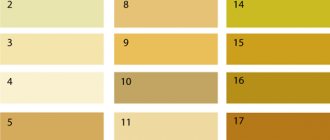
A practical solution for the kitchen is a light design of the countertop. Let's figure out how to correctly combine shades with kitchen items:
- Beige and cream are backgrounds for light aprons and sets. They look incredible when they border snow-white furniture.
- Sandy and warm bronze shades are the choice for light brown or dark facades. Perfectly emphasizes the wood design.
- Metallic is suitable for high-tech style. Creates a futuristic interior, not very practical, but beautiful.
- A light brown countertop is suitable for a classic design. A dark set will set off well.
- A golden hue will give a luxurious look to black and white furniture if its fittings - handles - are of the same color.
- Light gray design is not universal - it will look harmonious with white, gray and dark gray furniture. It is advisable to choose aprons in the same color scheme as the countertop.
We suggest you read How to remove varnish smell from wicker furniture. How to easily get rid of the smell of nail polish How to get rid of the smell of nail polish in a room
Light work surface
A light countertop is suitable for the interior of a kitchen of any style; it combines equally well with a light or dark kitchen. It is easily soiled and requires careful treatment on the part of the owner.
White color
The most popular and controversial color is white for the work surface. Glossy ideal surfaces are suitable for modern style, hi-tech, minimalism, Scandinavian. Combines with white or contrasting kitchen. A classic matte white stone countertop suits a conservative style.
Beige color
Beige in light shades of ivory, champagne, milky, vanilla, suitable for neutral countertops that act as a background for an apron or set.
The photo shows a white kitchen interior with a vanilla-colored countertop, which does not attract attention, but at the same time separates the upper and lower space.
Sand color
The sand color of the countertop should be selected for a kitchen with wooden facades and warm lighting, as well as for a dark set.
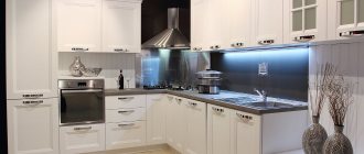
Light gray color
A light gray countertop is suitable for white, gray and dark gray furniture, as well as the color of concrete, which does not highlight the remains of splashes and possible crumbs as much as white.
The photo shows a light gray countertop on the island table and the main work area; the color matches the walls and looks organic with the white set.
Metallic color
Metallic color or a tabletop made of aluminum/stainless steel in a steel shade is best used when creating a high-tech style. This is a practical choice for kitchens where you cook frequently.
The photo shows a metallic countertop that fits into the blue and white interior of a modern kitchen and resonates with kitchen appliances.
Grey colour
It cannot be unambiguously classified as either light or dark: it all depends on its shade. Countertops of a gray (steel) color can often be seen in high-tech interiors. It is quite practical, the color is beautiful and unobtrusive, and perfectly sets off color accents.
Fans of “cold” interiors will definitely like gray.
Those wishing to choose a countertop from the “dark” list should take into account one nuance: if your kitchen space is small in area, it is better to choose a lighter option - dark colors “narrow” the space. It is also not recommended to choose dark fittings for owners of a kitchen of non-standard proportions: any errors, corners, or recesses will be immediately visible. If you do not want to focus attention on them, give up the gloomy color scheme.
Colored kitchen
For lovers of brightness and unusualness:
- Lilac and violet colors stimulate the appetite and look good in the Provence style. The apron can be mosaic or plain, the main thing is not dark.
- Yellow shades will attract attention, but they should not be too much. A bright kitchen and a yellow countertop will be enough to keep your eyes from getting tired.
- Orange is a warm, cozy color. It can be used in small kitchens with white cabinets, as well as in rooms where you need to add light.
- A red tabletop will successfully decorate white and dark facades.
- Pink is a surface color for silver, white and pink kitchens. It looks interesting and a little provocative. Glossy pink will complement the high-tech style.
- The blue countertop will harmoniously blend into the Mediterranean style. Catchy shades will create the perfect contrast with white floors, furniture fronts, and appliances.
- Green color is multifaceted - its light green shades will look good against the background of white, light gray and light brown pencil case and apron. An olive tabletop will complement the Provence style. Bright grassy tones will look better with white and cream kitchen furniture.
Choosing a color countertop
To create a bright accent in the kitchen, just choose a colored work surface, which will be complemented by wallpaper or textiles.
Red
A red tabletop is often found in combination with white and dark furniture. Red gloss can be repeated in the color of the dining table or floor finish.
Burgundy
It is better not to combine burgundy with red; it is suitable for the modern design of a light kitchen.
Orange
An orange countertop is suitable in combination with white furniture for a small kitchen, and in combination with dark brown furniture for a spacious room.
Yellow
Yellow adds light to the room, but it is best to choose it only for the tabletop and one other decorative item, such as potholders or a teapot, because yellow can cause eye fatigue.
Pink
Suitable for lilac, pink, white, gray headset. A kitchen with a pink countertop looks impressive and at the same time non-aggressive.
Blue
Blue is best combined with gray and white kitchens in Mediterranean and modern styles.
Green
It has a beneficial effect on vision and is suitable for any size room. A light green shade of the countertop is suitable for a large space and a kitchen set in white, light gray, dark brown shades. The olive color looks good in a Provence style kitchen and creates a noble atmosphere.
In the photo, the bright lime-green work surface acts as an accent and harmoniously combines with the white facade and mosaic apron.
Turquoise
A turquoise tabletop goes equally well with dark brown, white and black furniture, as well as with colored yellow and pink facades.
Violet
A purple work surface can be combined with the same walls, but it is better to choose a light beige color for the facades. A lilac countertop is suitable for a Provence style kitchen or a modern small kitchen.
The photo shows a combination of a purple table, countertop and mosaic tile elements in a colored kitchen, the set of which consists of three colors.
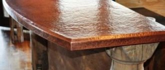
Black
This is one of the most controversial colors for countertops. On the one hand, stains from food or drinks will definitely not be visible on black, but on the other hand, any scratch will immediately catch your eye. Therefore, if you prefer a countertop of this color, carefully choose the material and texture. A black tabletop with small specks or stains will be much more practical than a plain glossy one. One of the most beautiful options is the “royal opal” color (yellow-golden stains on a black background).