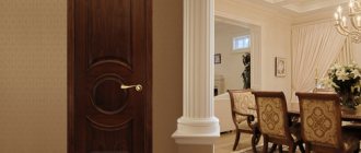
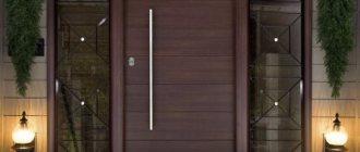
Laminate boards are one of the best options for flooring today. If you want to quickly decide on the color of the doors and floors during renovation, you need to take into account the nuance that more often you will be carrying out cosmetic rather than major repairs. And high-quality laminate and good doors are ready to serve for decades. Therefore, the color of both should be chosen in such a way that it blends well with any design of the ceiling and walls in the room.
It is also very important to take into account the fact that the final result is significantly influenced by many side factors: climatic conditions, sunlight falling from the window, and the position of the room.
How to choose the color of doors and laminate so that they fit harmoniously into the overall interior of the room?
Traditionally, there is a set of primary wood colors that are used in the manufacture of slats, baseboards and interior doors:
- Floral palette of warm yellow-red hue;
- Stained wood – black;
- White color;
- All shades of gray, and their cold range - smoky gray, milky white, etc.;
- Patterned combination of two colors;
- Light beige neutral color scheme.
When selecting the texture and color of both the floor and the doors, note that the glossy surface gives the room a solemn appearance. This is precisely why gloss looks unsightly in offices, where you want peace and comfort, and in bedrooms. For these rooms, the matte texture of the products is more suitable.
Also read materials:
The shine of the gloss is very beautiful, but, unfortunately, very finicky
A color scheme
Different combinations of shades and colors not only affect the style of the room, but also its atmosphere. Please note: there are no wrong colors, but there are bad combinations. Only in case of color balance can a successful color palette be formed.
Before selecting slats for doors, you need to study some of the features of color combinations in interior design. For example, the color of the door may be contrastingly different from the color of the laminate, but the color combination will not be disrupted. In this case, the colors of the floor, furniture and interior doors must match the color scheme: either cold or warm.
It is also important to choose the color of the baseboard. For example, if the floor is made in contrasting dark colors, and among a wide range of doors you prefer gray, then it is recommended to choose a baseboard that matches the color of the interior door. Dark-colored plinth can be chosen to match the tone of the entrance opening and the floor.
Neutral wood colors are easy to combine with almost any design
Furniture colors
Before choosing a new set for your bedroom, living room or kitchen, you need to study the wide range of materials from which the interior items are made. For example, products made from veneered or painted MDF have many different colors and shades. Color solutions for upholstered or cabinet furniture made from natural solid wood are more limited and, as a rule, depend on the texture of the wood.
Furniture colors with names
How to choose the color of furniture for a small apartment or a spacious country mansion? The choice of color is particularly influenced by the overall design, size, and purpose of the living space. To decorate a modern living room, decorators advise using deep, saturated colors; for a bedroom, lighter shades are more suitable; in the hallway, it is recommended to use the texture of valuable wood species.
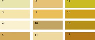
It should be noted that the color scheme may vary slightly among different manufacturers, but despite this, the entire variety of shades can be divided into groups. Each category has the name of the type of wood it corresponds to. Below are the most popular colors of furniture, photos with names will help you not to make a mistake with your choice and choose the right color.
Dark
Deep dark shades of the facade are often used to create aristocratic classic interiors. Exquisite design allows you to create an atmosphere of luxury and splendor in the interior, introducing notes of conservatism and respectability.
Dark shades include:
- walnut - traditional dark brown shade;
- wenge - blue-black or chocolate color;
- mahogany - spectacular dark burgundy decor;
- Ebony – African ebony has a unique black tone.
Ebony
Nut
Red tree
Wenge
To prevent the atmosphere from looking boring and dull, it is necessary to correctly select the shades of decorative coverings of the walls, floors and ceilings.
For furniture painted black, dark grey, chocolate or traditional brown, a neutral background is more suitable - this will create a calm, homely atmosphere. If interior elements with a mahogany texture are used to furnish a living space, it is recommended to choose wallpaper for the walls of a similar shade, but several tones lighter. A design with a dark color palette is ideal for spacious, well-lit living rooms, dining rooms, or hallways.
Dark wood tones
Light
Particularly popular are cabinet furniture items with light shades of the facade. Correctly selected colors can create the effect of maximum freedom and spaciousness in a small room. Light-colored natural solid wood is used to create interior doors and decorative wooden partitions. The snow-white surfaces of the facade fit harmoniously into any modern interior.
Decorated with gold or bronze floral patterns, the set will become a real decoration of the luxurious imperial style. Aged furniture in the Provence style is organically combined with blue and green wall coverings and is suitable for furnishing a country mansion or a small country house.
The most famous light shades include:
- Karelian birch - delicate yellowish tone with a pattern of knots;
- light ash - creamy background with an interesting smooth structure;
- pine - golden tone, characterized by richness;
- light beech - beige tone with a bright pinkish tint.
In fashionable modern interiors there are a wide variety of light facades: maple, pear, apple or acacia. By choosing furniture with a certain warm decor to decorate small, shaded rooms, you can fill them with light and add a little sunny notes to the overall interior.
Light beech
Karelian birch
Pine
Light ash
Intermediate
Neutral solid colors will help create delicate, pastel compositions, these include the texture of certain types of wood:
- cherry - has a rich reddish tone;
- alder - the texture has interesting reddish and rusty shades;
- oak - oak wood is easy to identify by its beautiful grain pattern.
Cherry
Oak
Alder
Moderately refined pieces of cabinet furniture that do not attract much attention add a special chic and aristocracy to any interior style. Multi-colored furniture is used to decorate rooms in the style of pop art, shabby chic, Provence or neoclassicism.
The location of the texture pattern on the surface of the facade allows you to create the desired visual effect that changes the actual perception of the size of the room.
How to choose the color of furniture for rooms with non-standard sizes? To decorate narrow, elongated corridors with high ceilings, designers recommend using furniture that has an intermediate facade texture with a horizontal pattern.
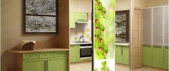
Chipboard colors
Possible colors of laminated chipboard
Neutral range
If choosing the color of the laminate causes some difficulties (after all, it must match the doors), then you need to choose a golden or warm pastel beige floor color.
The following types of wood belong to this color:
- Light alder;
- Honey birch;
- Light oak;
- Ash.
This decor can be easily combined with all wall and ceiling design options.
The main thing is that the wood does not have a red tint. Otherwise, it will be quite difficult for you to combine the color of the floor with the various colors of the ceiling and walls.
If a designer wants to choose doors to match the red laminate, he must be sure that the decor of the room will be consistent in the same color scheme, and also that the furniture will not change. For example, dark doors do not go well with a red tint.
Warm, soft colors are ideal for the bedroom. Peace and comfort
The floor, the texture of which is presented in light tones of acacia, ash, oak or maple, embodies carefree and optimism, giving the room tranquility. This is the most spontaneous color, and its main advantage is that it combines well with other colors. Thanks to its versatility, you can easily change the color of the walls or furniture in the future. In addition, this is the most unpretentious floor covering - scratches, specks and stains are least noticeable on it.
Laminate of the above colors with white or black will look quite strict, but cozy. But the combination of beige and yellow will fill the room with solar warmth and light. The combination of dark red and beige seems unusually bright. But beige and brown will give the room nobility and severity.
Darker tones will look great in a country style
Other interior solutions
When it comes to purchasing furniture made from natural solid wood, often the living space has a study area.
What are the design features of this room? It all depends on the preferences of the owner. A combination of walnut-colored furniture with dark green shades, such as emerald, malachite, and bottle green, will help create a classic style. The color Marsala and deep blue have the right to exist. Such an abundance of dark tones should be diluted with high-quality lighting and light surfaces of the rest of the interior.
Walnut color does not have to be used in furniture; a presentable design will be obtained by choosing a noble shade for doors or flooring.
Comment! If the office cannot boast of a large area, it is better to focus on honey-colored furnishings.
Wealthy segments of society prefer natural wood in all sectors of their homes, the bathroom is no exception. When choosing furniture for the bathroom, first of all you should take care of its reliable protection from high humidity. Sandy-golden shades of walnut look trendy in the design; it is better to avoid using Italian wood.
The noble color and expressive texture of walnut wood will give the interior of the room warmth and sophistication, regardless of its functional purpose. The main thing is to choose the right shade, taking into account the area and degree of illumination of the room.
Walnut wood is very popular in the furniture making industry. Designers love to use not only this material, but also imitation color, which is rich in shades and tones. Buyers are delighted with the beautiful walnut bedrooms, which come in both dark and light shades. Thanks to the wide palette of tones, you can use furniture made only from walnut in your apartment, and at the same time, the interior will look stylish and not monotonous.
But, despite the popularity of walnut-colored furniture, it is quite difficult to choose interior details for it. Because walnut is very selective in choosing color companions. Therefore, when purchasing furniture in the color Italian walnut in the photo, study the designers’ recommendations for choosing accessories and room decoration.
Considering that furniture in Milanese walnut color is noble and stylish, you need to carefully consider which wallpaper will suit this interior. You cannot use dark-colored wallpaper. The walls should act as a beautiful backdrop for walnut furniture. Therefore, the wallpaper should be light. Doors and floors should have similar colors.
To emphasize the stylishness of walnut furnishings, the background should be made as light as possible. More specifically, the color of the walls can be olive, pistachio, muted herbal, creamy. It is very important that the walls and floors are not painted in a cold tone. The walnut-colored furniture in the photo should be surrounded by a warm environment.
Yellow-red demanding palette
The red color for decorating doors and laminate flooring does not combine well with cold blue and cyan, as well as peaceful colors of all shades of purple, lilac, and light pink.
A harmonious combination will be combinations with:
- Orange;
- Terracotta;
- Brown;
- Green.
Laminate with the texture of Milanese walnut, cherry and other orange colors is more demanding of the surrounding interior. Cherry laminate flooring goes well with green, yellow and brown, as well as many other fall shades.
Increasingly - the brighter the orange hue, the more carefully you should work on decorating the room. The orange floor does not like rhyme, it does not get along well with both elegant and restrained boudoir colors and cold shades.
A floor with a merabou or cherry texture will make the room cozy and warm. But these exotic shades are quite capricious and demanding. For the record, they go well with colonial style furniture.
Some features
A selection of photos of walnut-colored furniture demonstrates not only the wealth of imagination of designers and constructors, but also the amazing compatibility of wood with almost all colors, except perhaps frankly contrasting ones.
And if burgundy, dark green, dark blue, light brown are classics, then red, orange, lilac are somewhat extravagant.
Cool shades of walnut fit original into interiors with light green, light blue or even white paints, while warm shades - with cornflower blue, beige and yellow colors.
It should be taken into account that walnut furniture should always be in the center of visual perception. This is the main element of the interior, especially if the items are large enough. Therefore, you should be careful in choosing flooring and choosing colors for the ceiling and walls.
Walnut stains harmonize perfectly with oak and other noble woods. In turn, many designers prefer to avoid using, for example, Milanese walnut and apple, cherry, larch, and anegri in the same room.
The peculiarity of American walnut is its refined structure, uniform and rich. This is wood that is perfectly suited for making stylish, expensive, even luxury furniture. Considering the richness of shades of this material, you can combine with it almost everything that is suitable for other types of walnut.
Walnut, even in modern interiors, is a classic element, and the selection of the environment for it must be approached carefully. Although, there is another approach: there are so many varieties of such wood that there is a successful solution for every idea, you just need to carefully study all the possibilities.
Tips for choosing laminate (video)
The gray color of the laminate will add elegance and serenity. But you should be careful when combining gray with other colors, despite its apparent versatility.
Gray laminate harmonizes perfectly with white and black, both separately and in tandem. The combination of gray and blue looks cold and quite strict. This range is suitable for a bedroom or living room. A combination of gray flooring with yellow will seem impressive. However, there should be significantly less of the latter in the interior. A bold yellow stripe on any wall, yellow curtains or chair is enough. This will create an atmosphere of carefree and joy.
Cool colors are very demanding in the selection of interior details
- The combination of red and gray looks very modern. True, this is a very sharp combination. It is relatively difficult for visual perception. That’s why professionals use the red shade in portions and, if possible, dilute it with white.
- Gray and orange are another good solution. These colors have a beneficial effect on the psyche and are comfortable for everyone.
- The combination of gray and green colors is rarely used, as it looks rather rustic. Beige and sulfur create a calm atmosphere. Useful as an option for modern and classic designs.
- The gray-violet color scheme looks glamorous. You can add white and beige here.
- This combination is well suited for a little girl’s or adult’s bedroom.
- The combination of pink and gray looks feminine, giving the overall look of the room tenderness and airiness. This is one of the best combinations for a girl's bedroom.
Alder color: combination in the interior with other colors
Alder color is a honey shade of wood. Combining it with cool shades of wallpaper in the interior will enhance its golden hue. Examples. Photo.
Alder wood has rich honey, reddish and red-yellow hues, some similar to golden oak, others to some types of cherry and walnut. Alder itself is not a valuable type of wood and is classified as medium-heavy in processing. It is not durable and has little elasticity, and is not resistant to rotting when applied externally or in contact with the ground. Contact with metal at high humidity leaves gray spots on its surface, on the other hand causing corrosion. Contact with cement is also harmful.
However, alder wood is uniform and soft, dries well, does not crack and retains its shape. It is easy to change: it is not difficult to saw, plan, hold screws and glue. It can also be polished, varnished and stained well. After processing, the color of alder can be similar to cherry, walnut, mahogany and even ebony. Alder is a common tree from Europe to Siberia. The relatively easy extraction of wood and its low characteristics determine the low price, but at the same time, its flexibility in processing and the ability to imitate valuable wood species has given it a decent segment in the production of veneer, and this includes alder-colored furniture, doors, and laminate flooring.
Alder and loro preto color combination
Or golden alder and mahogany. This is, first of all, a contrast in lightness, but the highlight of this combination is the richness of the colors of both types of wood: juicy alder is in no way inferior to the dark burgundy shade. Wallpaper for such a combination of wood tones should be no less saturated, preferably textured and with color transitions. To prevent everything from merging and maintaining contrast, use beige shades in the interior: bleached oak furniture or a beige carpet. For upholstery of upholstered furniture, use a combination of light beige and gray with a blue tint. Curtains will look good in a calm red-orange color. And the bright elements of the room, such as fragments of a painting or other room accessories, are classic orange.
Rustic alder and oak color combination
And this combination is built on contrast, but it is based on the similarity of the shades of alder and rustic oak: both have a golden undertone, but the color of the oak is also darker due to the dark brown touches - the pattern. This is a calm combination. In some lighting, the shades of these woods may appear similar. Calm wallpaper will help to continue the line of balance: without sharp transitions, in a neutral color. This way silk-screen printing will add a certain gloss and maintain the desired atmosphere. A mother-of-pearl sofa in a gray-lilac hue with rustic oak-colored armrests will help you maintain a chic atmosphere. Use the same shade of red carmine in curtains or other textiles in the room. A bright accent of the room will be a peach shade.
Combination of alder and bleached oak colors
Bleached oak is most often a cool shade, and in addition to a slight light contrast, it is a contrast of warm and cold. Against the background of bleached oak, alder will look more rich and radiant. To tie together these two colors: bleached oak and alder, choose wallpaper in a border color between cool and warm, for example, green tea with an olive pattern. A sofa for such a room would be terracotta in color with a pattern that includes a cooler shade of green. It is better to choose olive curtains for such a room, and the furniture is the color of bleached oak. For accessories, you can choose a bright pink shade, but not cold, but closer to coral.
Alder and Macassar color combination
This is a sharp light contrast between dark and light. What unites these wood colors is the golden-red-brown Macassar veining and rich color. A room in a combination of such types of wood will be eccentric, contrasting and bright. Add contrast with light lilac and purple striped wallpaper. To add chic to the room, use a glossy black leather sofa. It is also better to choose furniture in black with lots of glass. Curtains on the windows will look lilac-violet, and bright accessories will look purple.
lookcolor.ru
White color
When determining the laminate that is most suitable for a white door block, it is better not to get carried away by the game of contrasts. Even though white is a universal color, it can disrupt all design plans. If the decorative elements and window frames are white, then the doors should be purchased in a corresponding color.
The floor should be light in color. In combination with dark floorboards, a white door looks vulgar.
- White floors are associated with laconicism and cleanliness. White laminate is very often used in modern and minimalist styles. However, you can safely experiment with styles. White laminate will add brightness, visually enlarge the room, and give it a more progressive look.
- White is the optimal basis for other colors.
- The combination of green and white evokes a feeling of calm and freshness. This is an ideal choice for rest rooms.
- Purple and white evoke impressions of laconic luxury and elegance. A very progressive style solution.
- With crimson, white will add optimism, tenderness and lightness to the interior.
- Blue and white look best in small rooms, giving them freshness and some airiness.
- Red and white colors together are very contrasting. They also visually enlarge the room. The combination is relevant in children's rooms, living rooms and kitchens.
- A mixture of white and yellow adds purity and light. Perfect for classic rooms.
- The combination of brown and white adds respectability. And white and black are best suited for minimalism and high-tech style. The main thing is that one color does not dominate over the other.
Walnut in the kitchen interior
Walnut in the kitchen certainly creates the feeling of an expensive, beautiful interior. Ideal with white on tiles, wall paint, brickwork and accessories, as well as with warm shades: beige, yellow, orange.
But, there is an important nuance - red color does not suit walnut, even though it is warm. If you still want to combine walnut with red, place red items on other surfaces that are not adjacent to the kitchen facades.
A very good combination for the kitchen: gray walls and walnut furniture, in this case the interior will be a little stricter than with warm colors, but still very stylish and original. Walnut itself is a very temperamental, bright material, but it is easy to spoil, especially if combined with a very dark floor or walls.
For a kitchen made of Italian walnut, it is better to choose a light countertop in a neutral color: sand, gray, white marble, creamy, milky white, coffee or beige.
11
Dark wood colors
If out of all the abundance you like dark laminate the most, then it is best to focus on the following types of wood:
- Brown wenge;
- Dark chestnut;
- Dark stained oak.
The door design should be selected in a color that matches the floor. Dark colors when finishing the floor do not like contrast in the decor of door and window openings.
Black flooring represents luxury and elegance. However, a big misconception is the idea that black goes with everything. It must be mixed very carefully with warm shades. That’s why black is more often used in modern interior design options than in classic ones. Black is a symbol of wealth and prestige.
The combination of yellow and black looks very extravagant - a frivolous design that is conducive to a cheeky conversation.
But the brown texture of oak embodies the earth's security and comfort. A brown floor is a good backdrop for furniture in a rustic (Country) style. This is a very versatile color. It is suitable for many interiors. The main condition is as much sunlight as possible.
Brown floorboards look good next to green, beige, yellow and cream colors. With dark tones it looks elegant, but with black it looks gloomy.
Italian walnut color
Italian walnut is the most popular shade used for furniture production. It is more popular in our country than in the West.
This color has many characteristics, it:
- thick;
- saturated;
- soft;
- juicy;
- full of colors;
- rich.
The texture of the wood is extremely luxurious. It is characterized by clear lines and smooth transitions. This gives the interior sophistication, special charm, and comfort.
The Italian walnut shade is an excellent solution for fans of classics in the interior. The color is beautiful, but you need to choose the right furniture, walls, and flooring to match it so that the room looks elegant and not tasteless, tacky, and insipid.
How to combine the color of the floor, ceiling and walls
A combination of light colors on the ceiling, walls and floor visually expands the room. However, too many light shades will fill the room with coldness and alienation.
Even the completely black color of bog oak will find its connoisseurs
Of course, you can follow the manufacturers' instructions and choose everything the same color: both the doors and the floor. But try to make a more daring and original decision. You will succeed, the main thing is to follow a few rules if you decide to rely on your own strength and save on designers:
- The floor and door block of light shades, identical in texture and color scheme of wood, are suitable for small rooms with windows facing west or north;
- The contrast of the floor and doors looks advantageous in large rooms. However, in this case, you should be careful when choosing a plinth, which should match the color of the lighter door block.
- The color of the laminate and door block should be either a cold shade or a warm one.
The contrasting combination of doors and laminate must be clearly expressed. PolaRemont.ru reminds you that if this is not done, the design will turn out inexpressive and blurry.
Maintaining a single style in the design of door and window openings, furniture and floors is the main rule of harmony. But the choice of texture and color depends solely on design preferences.
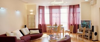
Decorating a living room with walnut-colored furniture
Regardless of the species, walnut wood has a distinct structure. The uniqueness and attractiveness of a natural design often does not require additional decoration elements. That is why living room furniture is often presented in laconic forms, with a complete absence of decor on the facades and hidden fittings. The ideal background for a colorful design will be plain walls painted in light and neutral colors.
If honey-colored furniture is chosen for the interior, then to create a cozy atmosphere, the living room design is complemented with the following tones:
- light yellow;
- ocher;
- muted orange;
- pistachio;
- mustard.
Advice! The problem of visually increasing the space of the living room, including the effect of raised ceilings, can be solved by installing dark walnut-colored furniture of small sizes.
A chest of drawers, an original coffee table or a floor covering, which is sure to be adjacent to very light walls and a snow-white ceiling, will do the job perfectly.
The desire to make the dark walnut color dominant is best satisfied in a spacious living room with good lighting. A large area, panoramic windows, high ceilings are the three main components that will advantageously emphasize the sophistication of dark furniture. If the walnut color is chosen for the interior of the living room as wall panels, moderation should also be observed here and not use them throughout the room, leaving at least one of the walls light.
Some limited space gives another direction for using walnut color in design. A laminated board in combination with a coffee table or chest of drawers is an excellent solution for the interior. In addition to furniture and flooring, walnut color looks great in the decoration of a fireplace; naturally, we are talking about an artificial hearth, where the surface around it remains without heating.
Examples of a harmonious interior, in which there is walnut-colored furniture, are presented in the photo:
Walnut in the bedroom interior
This is the most famous interpretation and use of walnut. It makes simply luxurious bedrooms, with rich carvings and reliefs. But simple, minimalist bedrooms look just as good, and all thanks to the beautiful texture of walnut. You will not need to add a huge amount of parts and accessories, since the furniture itself is already more than enough. In order not to overload the interior, choose a light background for the walnut: walls, floor, ceiling, curtains - everything is as light as possible, in a warm, sunny tone.
A combination of walnut furniture with light yellow walls and pastel green curtains will be very cozy. Add beige bedding and you have the perfect color scheme for a room with walnut furniture.
What type of furniture is most often used for?
The main color of Italian walnut furniture is used to make furniture sets for the living room and bedroom, kitchen, and office. Furniture of this color is not used in children's rooms, because it makes the interior heavier.
The Italian walnut in the living room attracts the most attention. Cabinets, coffee tables, as well as armchairs and bedside tables look especially advantageous. These items ennoble the interior and make it refined.
In the bathroom there is a cabinet under the sink.
Wooden furniture in the corner of the room.
In the kitchen, walnut is used to make countertops, kitchen units, and tables. The shade is combined with laminate or light coffee tiles, which makes the room light and spacious.
In the bedroom they are most often used to make bedside tables, dressing tables, wardrobes, beds, and chairs. For richness, you can make a bright accent on interior items to diversify the soft atmosphere.
In an office, walnut colors are most often found in cabinets, shelves, tables, and chairs. Preference is given to dark and beige tones.
Italian walnut color is used to make doors. They fit into any interior, chosen in a light palette, soft and delicate colors.
In conclusion, to summarize, we note that the color of Italian walnut has a positive effect on the emotional state of people who are in the room. It will charge you with vigor and positive energy, and lift your spirits.
A light yellow shade will help correct the insufficient lighting of the room, and a dark and brown shade will give the interior nobility and special luxury. Neutral and light colors will create comfort and harmony. Italian walnut is a self-sufficient color that always looks advantageous and harmonious in any room or interior design.
Table and side table in Italian walnut color
Kitchen island countertop in Italian Walnut
When creating elegant and respectable interiors, designers traditionally use walnut interior doors, which are distinguished by their rich texture and soft brown color. All shades of this wood are ideal for light walls and floors, combining perfectly with bleached oak, birch, light alder, maple and beech. In terms of popularity, walnut doors are not inferior to cherry and oak; they are regularly among the top sellers of all manufacturers of finishing materials.