The living room is rightfully considered the center of the apartment and house, since it is here that family and friends gather for rest and relaxation after a working day. For a good mood, relief from nervous tension and complete distraction from everyday life, the color of the walls in the living room is selected taking into account a number of rules used by professional designers around the world.
Features of choice
A correctly selected color scheme can visually make a room larger and more spacious, fill it with light, support the overall concept, and even eliminate some of the shortcomings of the room.
Criteria for color selection
- Features of lighting. Dim lighting can be corrected by using bright, light palettes that distribute light evenly and eliminate dark corners. If natural light enters the room in sufficient quantities or even in excess, preference should be given to cool, calm tones.
- Design and personal preferences. First of all, the color of the living room should be liked by its owners. In addition, if a certain style concept has already been chosen in a design project, it must be adhered to.
- Functionality requirements. The color of the finish can often act as a tool for zoning space instead of massive partitions or furniture groups.
- Living room area. A spacious room opens up more opportunities for realizing bright ideas. Here you can create a contrasting finish, or use smooth transitions. Small living rooms require the use of light colors and neat accents that will harmonize with other interior details.
Not all walls have to be painted the same tone, but there should be balance in everything. The finishing of the floor and ceiling is pre-thought out so that all surfaces fit well together.
"All in chocolate"
“If the owner of a bedroom decides to decorate it in chocolate tones, he should know that it is necessary to use contrasts”
contrasting bedroom in chocolate and white tones
For the bedroom, this color scheme is considered optimal. In such a room, it seems that everything around is saturated with the most delicious delicacy - chocolate, and even its smell is in the air. Here a person is calm, creative thoughts can come to him.
A few recommendations:
- If the owner of the bedroom decides to decorate it in chocolate tones, he should know that it is necessary to use contrasts. Then the interior will look elegant.
- Shades of “chocolate” should be given preference. It is advisable to use paint or use panels.
- If the room has a window, it is advisable to decorate it using blinds of an unusual color. The inside of the blinds can be painted cream, and the outside – chocolate. Blinds will provide the homeowner with protection from prying eyes and sunlight.
- When decorating the ceiling, preference is given to a combined ceiling in which soffits are mounted. There is one “minus” - you will have to pay a substantial amount. But it is this ceiling that will make the space whole. This will make it possible to correctly place light accents in the room.
Influence on the choice of cardinal directions
Any palette can manifest itself differently depending on the degree of natural light. This factor depends not only on the size of the window openings and their openness, but on the side of the world from which the room is located.
- South. Often there is not only enough sunlight, but also in excess. In order to reduce the “temperature”, it is recommended to use moderately cool shades (white, blue, turquoise, gray).
- West. During the daytime peaks, the room may be too hot and light, so there should be cool shades, such as mint (closer to blue), deep blue, gray, brown.
- East. It is recommended to give preference to pink and brown tones, which will benefit from the sunrise and compensate for its lack in the afternoon.
- North. Due to the coldness and short duration of sun hours, you need to choose warm, soft shades (beige, coffee, green, yellow). They will not only add light to the room, but also visually fill it with sun.
Before choosing the color of the walls for the living room, you need to consider the location and intensity of the lighting fixtures. If they are located around the entire perimeter of the room (in the form of LEDs or built-in lamps), the tint palette can be changed depending on the desired effect.
The uniqueness of color and its psychological perception
An elite delicacy made from cocoa beans - black, white and milk chocolate. There are coffee, beige, reddish and caramel shades. This entire palette is widely used in modern and classic “chocolate interiors”. This is the subconscious choice of those who value the comfort of home. Oddly enough, this setting is gaining the greatest popularity in tropical countries and northern regions. But they perceive and associate color differently. For southerners, terracotta is a natural material; for northerners, it is a “tasty” color.
Room design in chocolate color
Living room interior in chocolate color
Wooden furniture and floors of the listed color variations in the hallway, living room and kitchen are preferred by lovers:
- classics;
- ethno;
- colonial style;
- eclecticism;
- eco style.
This range is favorably perceived by conservative middle-aged and older people. Among young people there are many adherents of modern living room design in chocolate tones. In such an environment, many feel protected and confident in the future; the outside world seems to them more stable in the political and economic aspects.
Large beautiful living room in chocolate color
Bedroom in chocolate color
Chocolate color in the interior of the room
Reference
Wenge wood is an elite material for the manufacture of expensive furniture due to its special texture of shimmering tones of chocolate, pomegranate and chestnut with reddish tints. To reduce the cost, manufacturers mainly use natural veneer. This is a thin section of natural material applied to the coating of cabinet furniture facades made of cheaper wood. Laminate and parquet boards are the basis of lumber with wenge wood decor, which does not differ from the natural texture.
A work office or home environment, with a reasonable balance of contrasting shades, looks most comfortable. But under one condition - if the dark color is no more than one third on a light background. And it is important to choose one thing - cold or warm range of the spectrum. Based on examples from photos, it is easier to use leather furniture in this palette to advantage. Other people's experiences will help you choose a role model in arranging your home.
Advice. Professional designers help you choose the right combination of chocolate color with other tones in the interior. They work with classic style and fashion trends, balance and contrast, shape and configuration of objects. Their ideas are the best examples of how to decorate the living room and dining room, bedroom and bathroom in chocolate tones.
Dark bedroom in chocolate color
Feng Shui in the color scheme of the living room
The use of Eastern teachings when choosing interior colors allows you to determine the direction of vibration and energy, which will have a positive effect on a person’s mental and physical health. The teaching is based on the basic elements: Wood, Fire, Metal, Water and Earth. In this case, the finishing should be placed on smooth, even walls so that nothing interferes with the movement of positive energy.
Characteristics of Feng Shui flowers
- White. Symbolizes ideal, purity, light. For comfort and warmth, use in combination with another palette. An excellent solution is to add yellow tones.
- Red. The color of passion, activity, movement. It stimulates the appetite, but can sometimes cause attacks of aggression. When combined with gold, it attracts good luck. Red doesn't go well with black. The palette is not recommended for use by people with diseases of the nervous system.
- Orange. Combines the positive energy of yellow tones and the power of red. Conducive to a pleasant conversation in the guest room, attracts prosperity and kindness.
- Gold. Denotes respect, honor, status. Previously, only rulers could use this color in the interior. The golden palette has a positive effect and attracts money energy.
- Black. In fact, it is not considered a mourning color, but a magical color according to Chinese teachings. But many still equate it with negativity, so it is better to minimize the use of black or use it for accents.
- Blue. The main association is water. The palette has a calming effect, restores harmony, relaxes and is suitable for meditation. Blue stimulates spiritual energy and intuition.
- Green. The color of calm, peace, nature. It stimulates wealth and well-being, means life, growth, harmony with others. Pairs well with yellow and gold colors, creating the energy of success.
- Yellow. Symbolizes positive energy, success, happiness. It attracts warmth and makes the living room cozy, evokes an optimistic mood, and attracts good luck.
- Violet. It has mystical, magical properties. Suitable for creative people, symbolizes material well-being.
When choosing not one, but several wall colors in the living room interior, it is important that they indicate one direction to enhance energy. You should be guided not only by the above characteristics, but also by your own preferences in order to create a cozy interior.
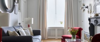
From monochrome to avant-garde
If you look at the photo of a living room in a classic style, you will notice that not only the walls, ceilings and floors are made in beige tones, but also the furniture
However, if you pay attention, all items are presented in different colors. Furniture is slightly darker than walls and ceilings
And paintings and other tabletop items have dark brown and yellow frames. This style is called monochrome and involves a combination of smooth glossy and matte surfaces with convex or rough materials. This can be wallpaper with fragments of silk-screen printing on a relief background, or patterned convex furniture upholstery. The wood pattern of the flooring, the roughness of the plastered ceilings, the smoothness of the marble surfaces of the fireplace - all of this serves as a decoration for the room. Even a non-professional can complete such a simple design.
The sandy ceiling and wallpaper on the walls will come to life with floor vases and sofa cushions in bright oranges and bold yellows. With them, any room will seem warmer and more comfortable. And if you are a lover of coolness and seascapes, then the interior of the living room in beige tones can be enlivened by blue and blue additions in the form of accessories, glassware or paintings. The greenery of indoor plants will enliven a seasoned style and add a little freshness. Don’t be afraid to add other colors because of the uniqueness and conservatism of the beige tone.
All shades of red, lilac and purple can give the room a festive look. For example: lilac armchairs and a purple sofa will add a bright note to the monotonous and calm look of your room in a classic style. To visualize such a bold idea, we have placed below a photo with colorful furniture. Anyone who loves avant-garde style and originality can enjoy the designers’ ideas and turn them into reality on their own territory. It cannot be said that light furniture is suitable for a married couple with children. It is bright and dark furniture that will hide small stains that are inevitable in the presence of children and pets. The main thing is not to overdo it with colors so that the main beige background prevails. And the bright additions were not numerous.
Optimal solutions
Gray background
A modern, popular palette that is suitable for both classic and loft, minimalism, and modern styles. For greater effect, it is complemented with geometric textures. Thanks to the variety of shades, it is suitable for rooms of different sizes.
Yellow scale
When choosing, you should pay attention only to pastel and calm shades, and not bright and flashy shades, which will negatively affect your relaxation and cause nervous tension. Sunny, warm yellow is associated with summer and comfort. In spacious rooms it can be used for all walls, in small living rooms - for interesting accents in decor, photos, etc.
Brown tones
Mainly used for classic solutions. More saturated and deeper shades are chosen for accents, coffee, chocolate, etc. for the background.
Olive shade
Well suited for Provence, Scandinavian style, country. A soft, natural, pastel shade of green is suitable for rooms of different sizes and locations. The noble tone gives coziness and comfort and goes well with other soft tones.
Light orange
Associated with rich summer colors. It is used for various interior solutions and will become the highlight of a mixed style of classic and modern. Pairs well with turquoise and gray. Looks good in dark living rooms with windows facing north. It also compensates for the lack of lighting.
Shades of beige
A popular, versatile, practical color that can be used to decorate any living room. The room will be warm and harmonious. For decoration, bright, rich colors, imitation brickwork, and textured plaster are used.
Shades of turquoise
The turquoise palette will give you a feeling of freshness, freedom, and spaciousness. The shades are presented both rich and deep, and pastel, fresh. It goes well with different color options without overloading the interior. Makes a cool palette softer and more appropriate. More suitable for spacious rooms, plays well as accents.
Natural shades of green
A natural, comfortable palette that symbolizes life. Various shades are used in the living room interior. Often gamma is used to zoning space. Pairs well with shades of gold, brown, and floral prints.
White background
Strict and restrained, but at the same time, a neutral color that can be used as a base for any style. Its color palette is wide and varied, and textured application will open up new facets of white. The palette visually expands the room, fills it with light and warmth, and eliminates dark corners.
About the features of a bedroom in chocolate tones
classic bedroom interior using chocolate and white colors
Chocolate brown tone can dominate when decorating a bedroom. Especially when the room is spacious and daylight illuminates it well. There is one nuance: we must not forget about other shades. Otherwise, the room may seem gloomy and evoke sad thoughts.
The best option is a combination of dark shades and light furniture, and vice versa. It is necessary to create a dark setting on a lighter background.
in bedroom design, chocolate color can act as a dominant color
Chocolate tones in the bedroom create a beautiful combination with the following color groups:
- All shades of close beige tones. You can safely use them. The brown color scheme with hints of gray and coffee tones looks good.
- If you use a green-lime color scheme, in combination with a brown-chocolate tone. It looks fun and summery. To make the bedroom look luxurious and noble, you should give preference to rich emerald shades.
- For a harmonious contrast, you can choose a combination with orange, peach, and pale pink.
In a light chocolate-colored bedroom, aged wooden furniture looks great
Lovers of marine motifs can consider combining brown tones with turquoise, blue, and white. The main thing is that these flowers have a metallic sheen.
Bedroom in brown and yellow design
combination of chocolate, pink and yellow in the bedroom interior
It is known that chocolate in tandem with orange and yellow shades looks great. The brown + golden combination has become widespread. Only there should be a little of it. If you choose this option, the apartment owner will not go wrong. The room is immediately transformed, and the residents feel comfortable in it. It is advisable to choose curtains and drapes, accessories and pillows in shades that match the brown color.
Bedroom features using pink and blue
blue color brings a touch of freshness to the interior of a chocolate bedroom
It is known that pink goes well with chocolate color. This combination speaks of nobility, style, and elegance. This solution has its own twist. The chocolate tone tends to extinguish the “sweetness” of pink. It softens it and makes it attractive.
This option will suit a bluish tint. It is appropriate to finish large surfaces and upholstery. The homeowner can add this zest to the bedroom interior on his own.
Bedroom in beige chocolate tones with photo
This interesting solution is suitable for different rooms, including the bedroom.
combination of beige walls with chocolate furniture and curtains
Advantages of a bedroom with beige chocolate wallpaper:
- this room will be one of the ideal options;
- this design has become popular among the population;
- the room visually appears larger;
- the interior looks noble and cozy;
- indoor plants would be appropriate, in this case, as would green accessories. Then the interior seems alive and complete;
- if you want to make the interior warmer, use red accessories.
White chocolate bedroom design with photo
the tandem of chocolate and white colors in the bedroom is classic
This color combination is considered classic when creating interior design. This combination will emphasize the good sense of taste of the apartment owner and make the interior more “alive.” In this version, you can see how respectable the owner of the property is, and what elegant style he has chosen.
in this case, chocolate-white tones in the bedroom are diluted with green textiles
As you can see in the photo, a white chocolate bedroom will not be boring if you add gray, olive, emerald and brick tones. If the bedroom is made in a modern style, this solution will look more successful. Chocolate-colored walls will harmonize with furniture, textiles, and light-colored accessories.
Such a room should have a lot of light.
Chocolate green tones when decorating a bedroom
harmonious combination of chocolate and light green tones in the bedroom
To create the softest atmosphere, it is advisable to choose this combination. When soft green tones are used, it reminds of the beautiful moments of spring. The light green color represents the awakening of nature after winter. Looking at it, a person thinks about spring shoots that grow through the thickness of the earth and reach for the sun.
mint wall decoration brings a touch of freshness to the chocolate bedroom decor
Very often, green shades are associated with spring. People feel good in such an interior. They relax, recharge with energy and spring mood even on cold winter days!
Bedroom in turquoise chocolate tones: everyday luxury
Turquoise and chocolate tones in the bedroom are rich and dense in themselves. That is why it is important, when using them, to ensure that one dominates and the other complements. For example, if there is wooden furniture in the room, and the walls are made in soft turquoise tones, then the presence of massive things will seem like a good solution. The furniture will not stand out from the overall picture of the room. When the walls of the room are made in chocolate or rich coffee tones, the interior seems cozy and light if pastel colors or curtains in turquoise tones are added.
combination of chocolate and turquoise in bedroom design
A bedroom in turquoise and chocolate tones looks elegant and chic if it has wooden accessories or furniture . Then it will look holistic and complete.
The combination of chocolate (or brown) with turquoise for bedroom decoration is used in a vintage or natural style. It is pleasant to relax in such a bedroom. There is a feeling of warmth and comfort.
choosing pink as a second color for a chocolate bedroom is perfect for a teenage girl
A chocolate-turquoise bedroom looks great if you use contrasting tones. It is important that one color is darker than the other.
Characteristic stylistic palettes
- Contemporary. Modern style allows you to use more bright colors such as blue, turquoise, emerald, lilac, etc. A combination of several contrasting colors in one room is typical.
- Scandinavian. The style is characterized by the use of beige, gray and white tones, as well as shades of blue. The color should be harmonious and maintain spaciousness.
- Classic solutions. These directions are characterized by muted, calm colors of brown, green, and blue. Only one shade is used in the interior; patterned wallpaper is used for accents.
- Loft. A modern solution for decorating a living room. Mainly cold, calm tones are used for the interior. Gray and white go well with brick. For such an “industrial” idea, you can use black.
- Country. A rustic theme is impossible without natural shades such as brown, green, soft yellow, blue, peach, olive, etc.
- Provence. The base is pastel colors such as olive, beige, lavender, etc. It has a natural, restrained palette.
The palette of each style may vary depending on the functional purpose of the color, the area of the room, and personal preferences. If, according to the design project, the implementation of non-standard tones is appropriate, there are no restrictions for bringing such an idea to life.
Furniture for brown design
Furniture in this color is always considered relevant and fashionable, only the shades change. Very often, a brown tint can be found in the design of a living room made in the style of classicism, but other trends also use it in their design.
Different shades of this color can be perfectly combined with each other. But don’t forget that it doesn’t go with every color. When choosing shades, do not forget about the area of the room. If the room is not very large, a lot of dark surfaces can make it gloomy and visually reduce its space.
Types of color combinations
- Contrast. This color combination is used to implement modern interiors. You can choose the most unexpected colors if you place them correctly in the room. Use options - accent wall, geometric patterns, stained glass or panel effect, etc.
- Neutral combination. Opens up ample opportunities for the implementation of original ideas. Delicate shades are suitable for classics, for modern solutions - cooler palettes.
- Monochromy. The use of one color scheme allows not only to visually preserve the area, but also to expand it. There are many combinations, since each color can have dozens of shades. Without overloading the interior, you can zone the space.
- Two colors. The use of two different colors is acceptable for spacious rooms, but other solutions can be considered if both shades are light. It is important that the colors chosen are from one half of the spectrum. The transition is smooth, the gradient method is popular.
The use of several combinations is possible only if the living room area is 25 square meters or more. Then one of the zones can be decorated for relaxation in soothing colors, the other can be decorated for receiving guests, etc.
Bedroom-living room
It’s not very often that you see a living room combined with a kitchen. This option is unlikely to be used in two-room or three-room apartments. In a large family, such a layout will not take root. However, owners of small apartments may consider using such a layout in their apartment. To zone the space, use a shelving unit. This lightweight partition does not block natural light and provides extra storage space.
Bedroom design with living room
. A good example of a combined bedroom-living room in a one-room apartment!
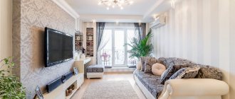
Choosing colors for a small living room
To decorate a small living room, light, calm colors are used that will be in harmony with other interior elements. It is better to avoid patterns and prints, as they may make the room seem smaller. Decorative items and furniture are used for bright accents.
To visually enlarge the room, you need to think about a lighting scheme that will highlight the color of the walls, and also hang mirrors. If you use wallpaper or decorative plaster, they should be discreet, monochrome, without unnecessary details that could negatively affect the visualization of the space. An interesting solution could be to paint an accent wall in a different shade, if you choose the right color.
Materials and design
The living room in the spirit of classicism categorically gravitates towards natural and expensive materials: marble and granite, other rocks, valuable types of wood, bronze, copper, gilding, velvet and silk, inlays and precious metals.
Floor finishing
For a classic living room, there is no better choice than graceful and elegant artistic parquet flooring. A touch of antiquity, abrasions, and small defects will give it a special sophistication. Moreover, the living room is one of the few rooms in the house where it is really advisable to use natural parquet.
If you prefer more modern interpretations of style or don't want to sacrifice practicality, choose laminate. Nowadays there are a lot of collections that imitate any other materials, textures and patterns. An even more radical alternative is stone slabs or porcelain stoneware.
Wall decoration
In the living room, feel free to take all those wall coverings that are not suitable in the kitchen or hallway. For example, these are paper or textile wallpapers - a combination of natural textures with ornate patterns
Pay attention to wood paneling, tiled mosaics, or combinations of several different materials at once.
Ceiling design
Popular stretch ceilings are not very appropriate in classic interiors, but complex plasterboard structures are easy to use in different ways. If you still choose PVC film, take a satin or matte fabric. And if the even base of the ceiling allows, it is enough to simply whitewash or paint it.
Photo gallery
Our gallery features photographs of completed projects demonstrating the correct use of color for living room walls.
Examples of successful color combinations in real apartments
Light green sofa and beige roller blinds
Beige wallpaper and sofa, beautiful green curtain
Inspire us - share the material with your friends on social networks: