The issue of choosing the color of curtains is no less important than choosing a style. A correctly selected color scheme will help to visually expand the space, make the room brighter, or, conversely, steal the last rays of the sun. In order not to make a mistake, you need to be guided when choosing a general rule: bright and warm colors help add light, while fresh and cool shades cope with excess sunlight.
Curtains are a decorative element that allows you to change the appearance of a room with a minimum of effort and expense. Therefore, you should not treat the purchase of window decor in the same way as a new sofa. Even if after five years the sofa remains, then changing the curtains to suit new fashion trends will help change the interior at any time.
What to combine curtains with?
There are no strict rules governing the choice of curtain color. No designer will tell you: “Choose the color of the curtains to match the color of the wallpaper” or “Buy curtains to match the upholstery.”
Curtains may not match anything in color at all, but fit into the interior in style, texture, ornament, style. Of course, such a bold step requires design flair. If you find it difficult to choose the color of curtains , listen to our advice.
How to choose the color of curtains: a few simple rules
1. To save money. For thrifty owners, it is recommended to choose the color of curtains and drapes to match the furniture upholstery , and not as is customary in most families: they made repairs, glued fresh wallpaper, and then changed the curtains to match their tone. Wallpaper changes more often than furniture, and its price is not commensurate with the current cost of furniture and the curtains themselves.
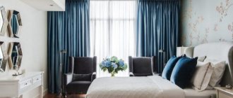
The color of the curtains matches the color of the upholstered furniture
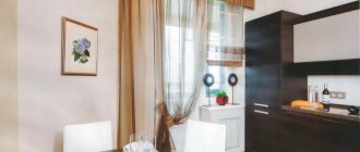
If saving is not part of your plans, you can safely choose curtains to match the color of the walls.
Curtains to match the color of the walls
Curtains to match the color of the walls in the bedroom
Pink curtains to match the color of the walls. Photo from housetohome.co.uk
2. Win-win. If there are a lot of colors in your room, so you get lost and don’t know what to combine the color of the curtains with , choose a fabric for window draperies whose color practically matches the color of the largest piece of furniture in the room (large sofa, carpet on the floor, kitchen fronts, bedspread and canopy in the bedroom, etc.). It's a win-win move.
The color of the curtains matches the color of the kitchen facades
Curtains, bedspread and canopy are the same color. Country style bedroom
3. In neutrality. If the interior is not designed by a stylist, and you have doubts about your own design abilities, you can choose neutral shades of curtains (sand, cream or beige), which are always in fashion. In this case, it will be quite easy to change the style and mood of the room without changing the curtains.
Neutral color of curtains in the bedroom, which is supported by other interior elements and textiles. Changing the mood of this room will not be difficult.
4. Color connection. By choosing a neutral shade of curtains, you can connect them with other interior elements of a darker, lighter or brighter color: for example, decorate the window with additional colored drapery or lambrequin, or make curtains with colored edging, etc.
Neutral-colored curtains with a splash of color for the tie
5. Window in the spotlight. If you want to draw attention to the window and take your eyes off another, not the most successful component of your interior, choose bright curtains, preferably not plain, but striped, checkered or printed. Combine the interior components with bright curtains: make a tablecloth, napkins, sofa cushions, floor lamp shade, etc. from the same fabric. Buy other accessories in the same color and pattern as the curtains.
Bright curtains in a bright, “neutral” bedroom. The color of the curtains is supported by pillowcases and bedspreads, as well as the upholstery of the chair
6. Multicolor. If your interior is polychrome, that is, it contains a large number of colors, give your eyes a rest by choosing not very bright plain curtains to match the color of all the walls or just one wall (if a combination of colors was used in the decoration of the walls).
7. Monochrome. If you want to create a monochrome interior, it is not necessary to choose curtains whose color exactly matches the color of the walls and/or bedspreads, upholstery and other textiles. Choose curtains that are not identical, but a similar shade, or choose two-tone curtains so that the window stands out rather than blends in.
A good choice of curtains for a monochrome bedroom
A good choice of curtains: the monochrome is not broken, but another shade is unobtrusively introduced into the interior - green, while the curtains do not merge with the walls
And one more piece of advice not related to the color of curtains: the simpler and smaller your curtain, the more expensive the fabric from which it is made should be.
Basic principles for choosing curtains for blue wallpaper
When choosing curtains for blue wallpaper, you must also pay attention to the general style of the room, furniture, paintings, ceiling, etc. The classic color for blue is white.
At first glance, there is nothing complicated in choosing curtains: I measured the height, cut as much as needed and bought it. But all the simplicity evaporates somewhere as soon as it comes to matching them with the overall design of the room. After all, everyone is trying to make their nest as cozy as possible, while not forgetting about style. That’s why so much attention is paid to choosing the main color of the room, selecting wallpaper of the intended shade, and only then finding accessories that harmoniously combine with it.
Taste and color
Many people like the color blue, the color of the sky and sea, poise and inner balance. Psychologists have proven that it is associated with freedom, peace and quiet, a feeling of flight and infinity. Therefore, when decorating premises, its entire widest palette is used.
This color scheme is found in almost every style from classic to high-tech. It is often complemented with gold and silver details, which emphasize all its advantageous aspects.
Curtain color and room size
It's no secret that the overall impression of the room depends on the color scheme. You can visually expand a 7-meter kitchen, as well as hide the “extra volume” of a large living room. To do this, you just need to choose the right color of curtains .
Warm colors from violet-red to yellow create the effect of enlarging and “bringing” the window closer.
Colors included in a cool color palette visually distance the object. Curtains, for example, pearl, blue, lavender, soft green and other shades can help achieve this effect.
Light colors make the room wider, while dark colors make it appear smaller.
If the wallpaper is gray, what curtains are suitable?
A simple and neutral palette will be ideally combined with a variety of shades - from delicate pastels to bold and rich ones. One of the main accessories that makes it possible to dilute the gray is textiles. With the help of curtains and curtains, you can solve several functions: add lightness to the room, zone it, fill it with warmth.
Curtains in cool tones work well for cool-toned walls.
Note! All scales used must be connected into a single composition and have a similar style.
purpose of the premises
For a bedroom, which is considered a relaxation area, it is advisable to choose muted shades that will not interfere with relaxation. Flashy and bright colors are only possible in accessories. Pleasant green, dark blue (but muted), creamy gray and pearl tones have a good relaxing effect.
Curtains for the living room can be very different , here the flight of imagination is not limited, the main thing is that the color of the light tulle curtains and curtains fit harmoniously into the overall color background of the room. This is exactly the room where vibrant experiments are possible.
Curtains for the kitchen play an important role, since in most cases this room is quite small in size. The color scheme of the curtains depends on the chosen interior style , it can be “country” (usually light curtains with pastel stripes and checkered patterns or with bright patterns - floral, bird, etc.), “hi-tech” (minimalist curtains with a cool shade ) or classic (plain curtains of any suitable color or two- or three-color striped or checkered curtains).
Country style kitchen curtains
Country kitchen curtains
In most cases, the main canvas of the kitchen is made light enough to provide access to the sun, and its framing completely depends on the wishes of the owners. A dark curtain in the kitchen is possible, but it is usually a lambrequin curtain or a Roman blind - that is, the window decor does not interfere with the passage of light into the kitchen space.
Bright Roman blinds in the kitchen
Selecting curtains
Curtains for windows are almost the same as clothing for a person, so you need to choose them wisely. It is enough to choose the right tone and fabric pattern, and the room will acquire exactly those qualities that it lacks. Of course, in some cases, designer flair helps to choose the right curtains, but more often than not, even experienced specialists resort to simple rules. For example, is it possible for the wallpaper and curtains to match in tone? If the room has blue wallpaper, what curtains would be more appropriate? Of course, a match in tone is not excluded in the following cases:
- If you need to maintain the unity of space. But most often, designers suggest choosing a wallpaper tone that is several units darker, or, conversely, lighter (blue wallpaper - blue curtains).
- If the wallpaper has a pattern or design. Thus, the presence of a pattern or ornament on the canvas allows a combination with plain blue curtains.
- If you need to visually move the wall with the window. Well, to visually bring the wall with the window closer, you need to prefer brighter, more intense shades of curtains.
- If double window decoration is expected (tulle and curtains). In this case, one of the window design elements should be as close as possible to the tone of the walls. For a blue shade of wallpaper, you should choose snow-white tulle and blue curtains, or you might prefer blue tulle and aquamarine curtains.
Roman blind that does not block the passage of light
Curtain colors and color combinations
It is clear to everyone that even the most persistent proposals, no matter what fashion trends they are regulated by, will not be heard if the residents of the premises categorically do not like the proposed color. You shouldn’t be led by fashion: remember that you should like the color of the curtains , and you need to build on this and select the shade that will be most suitable for a specific design.
Choice of curtain color: white curtains. Despite its ability to expand space, in its pure form white color is too aggressive, so it is better to soften it with any additions of pink, coffee or beige or combine it with other colors.
Choice of curtain color: yellow curtains. The color yellow is believed to stimulate mental acuity and productivity. Its bright shades visually expand the space, so curtains of this color are good for the living room and office.
For the bedroom and kitchen, it is advisable to use calmer tones.
Yellow curtains are good for a children's room, especially if its windows face north. Psychologists recommend hanging “sunny” curtains in the room of a melancholic child.
Bright yellow pairs well with green and white, but its more neutral tones that fade into beige will work with other colors as well. The combination of yellow and blue is also successful.
Choice of curtain color: green curtains. Although green curtains are most often used in living rooms, soft shades of green are also suitable for dining rooms. This color calms and induces peace, so green curtains can also be hung in the bedroom.
Choice of curtain color: turquoise curtains. This color has not gone out of fashion over the past years, but demands respect. Bright shades of turquoise look good with a decent frame (for example, in a living room with expensive furniture), while light midtones are suitable for a child's room.
Dining Room By Jonathan Adler for Liz Lange
It is best to use turquoise color in curtains not as part of a single fabric in order to maintain a sense of proportion, but as an additional color accent. In this case, a combination with gilding is suitable.
Choice of curtain color: blue curtains. Blue is a softened version of blue, it is calming, and therefore blue curtains are well suited for the bedroom. To prevent the room from looking dull, it is worth adding accessories such as pillows or paintings in warm colors - they will make the room more comfortable.
Blue curtains. The blue color in the interior relaxes, making the room feel cooler. It goes perfectly with white, like most colors, but in such a set it looks very cold. Shades of yellow and beige will help soften this effect. Blue in a single design “extinguishes” the light, creating a feeling of darkness.
Choice of curtain color: red curtains. The red color for curtains in its pure form is rarely used because of its brightness. The abundance of red puts pressure on the subconscious, and it also hides the size of the room. But in combination with warm shades, muted red is perfect for the living room.
If the bedroom has furniture made of natural wood, then it will also be emphasized by light red organza or similar decor of shadow curtains.
Choice of curtain color: orange curtains. Orange is the opposite of red, it refreshes any room and looks good in children's rooms, living rooms and dining rooms. A stylish and noble solution is the terracotta shade, which is at the height of fashion.
Orange curtains in the bedroom
From apartmenttherapy.com
We select curtains for different rooms and interiors
Blue walls perform slightly different functions in the design of different rooms. What they do best is create a calming atmosphere, which is in demand in the sleeping area. Pale blue tones are appropriate here, both in the form of a solid canvas and in the form of a pattern or ornament.
In the bedroom, it is recommended to use white or beige curtains under blue wallpaper in order to reduce the oversaturation of the room with this color. You should not buy wallpaper that is too bright. Because in this form, blue does not calm, but on the contrary, it creates tension and provokes brain activity.
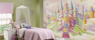
But for a children’s room, this option is appropriate, although you shouldn’t overdo it here either, since this is a place where the child not only learns homework, plays with friends, but also relaxes. It is better to divide the children's room into functional areas. Do this with wallpaper, covering the workplace with bright paper and the relaxation area with light-colored canvases. This solution will be an excellent option for a large room. If the room has limited dimensions, then use light colors, they will visually expand the space, decorate the design of the nursery and help the child in his development. Gray-blue curtains are suitable for a young man’s room or office.
A blue kitchen is a rarity. Because this color dulls the feeling of hunger. But if you have no problems with appetite and want to lose weight, then this color scheme is what you need. Although if you choose bright and saturated shades close to blue, the situation will turn out differently. These are the colors that encourage physical activity, and therefore appetite. Light curtains for a blue kitchen are a stunning duo that will evoke pleasant emotions and admiration.
The guest room is the place in the house where you can use bright and bold colors. Here it is allowed to use a large number of decorative elements that literally enliven the atmosphere.
What color of curtains will go with blue wallpaper in the living room? Almost any textile:
- in light,
- beige,
- rich dark shades.
If you want to make your living room more cozy, use as many indoor plants as possible. And if your guest room is made in a marine theme, then the ideal option is combined curtains for the blue wallpaper in the living room, consisting of beige and blue fabrics.
A room with blue walls is decorated in different styles. Today, designs that mix history and modernity are in demand - neo-baroque, neoclassicism, etc. Blue favorably complements the gold and silver interior elements inherent in the above styles, softening their pretentiousness and excessive showiness, but at the same time maintaining a feeling of luxury and festivity.
Scandinavian interiors look attractive, although here the predominant color is still white, and blue is used as an additional color. Often blue canvases are found in a rustic style. As a rule, they are presented in dark, rich shades, which are combined with wooden furniture and small windows that do not “eat up” the light.
In modern stylistic solutions, this color is extremely rare. However, you shouldn't give it up. You can limit yourself to one blue wall, which will focus attention.
The best shades of blue
Depending on the saturation, blue color can be cold or warm. But in the right proportions, light blue colors can add tenderness and lightness to the bedroom interior, this will contribute to the best possible rest.
When designing a blue bedroom, you should take into account that different shades of blue in the bedroom interior can play differently depending on the location of the room.
The best combination is considered to be blue and white. This interaction of colors gives the interior cleanliness and freshness. White color makes blue not so cold.
In this design, it is better to use white furniture and blue tones for the walls of the room. Textiles will also look better in white colors. A bedroom interior in bright white and blue colors can seem very cold. This will be especially noticeable in a dark blue bedroom.
But if you use more gray shade, it will give the interior more elegance. This kind of bedroom is more suitable for a man; gray color adds masculine energy to the interior and adds to the atmosphere of a quiet room.
For those who like bright accents in the interior, it is recommended to add green and yellow shades.