What wall color will suit this or that type of wood?
Whether for flooring or furniture, birch, beech, cherry, walnut and other types of wood vary significantly in color and texture. Therefore, the question of what wall color will suit a particular type of wood can be answered in different ways. Light, rustic woods with knot holes are suited to completely different colors than fine-grained reddish wood or dark rootwood. From this material you will learn what wall colors for different types of wood are recommended by color experts of the Alpina brand.
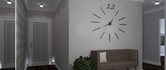
First, choose the main wall color
Decorating any room or its walls begins with choosing a color that matches the wood used for flooring or furniture. At the same time, you can deliberately rely on contrast or create a harmonious tone-on-tone finish. The following general rules apply. Painting the walls a color that contrasts with the color of the wood brings out the shade of the wood. If you decorate the wall and the tree in the same colors, both elements will be perceived equally and combine harmoniously with each other.
What color goes with walnut or wenge?
Dark woods can be combined with a range of different colours. At the same time, the effect can also be very different: from noble to mundane, from modern to meditative.
- Noble: The combination of dark wood with light shades of brown or beige, complemented by dark red accents, looks very noble. This color combination is typical for the colonial style.
- Stylish: Light gray with accents of dark red and anthracite creates a stylish atmosphere with a calm, meditative character. Depending on the furnishings, this color combination can also be used to create a minimalist zen style.
- Harmonious: Using shades of yellow, apricot or mango, you can create a warm, cozy atmosphere with a Mediterranean flavor. Combining dark wood with different shades of green can be relaxing or invigorating. The delicate mint hue is soothing, and the fresh color of young greenery revitalizes.
What color goes with gray pine?
Gray pine wood, which has a silver-anthracite sheen, harmonizes with both light gray and blue shades and dark red tones.
- Fresh: Gray pine goes great with light green flowers with a slight yellowish tint. By painting the walls in different shades of green - olive, the color of young greenery or grass, you can create an atmosphere of freshness, inspiration and motivation in the room. If you need to visually enlarge the space, combining pine with a fresh blue color will help. The coolness of blue can be balanced with accents or warm wood furniture.
- Feminine: Playing with dark shades of red gives a room a feminine and warm touch. For a modern design with a feminine style, colors such as violet, lilac or berry are ideal.
What color goes with pine or alder?
Pine and alder are characterized by medium brightness and color saturation. Light, cool colors go best with them: blue, different shades of gray and bright white. Such walls contrast well with wood, creating an atmosphere of freshness.
- Scandinavian style: Scandinavian style design is characterized by a combination of warm wood tones and cool colors. Walls in a light and cool gray, blue or white color in a room where the furniture and flooring are made of pine or alder will create a relaxing atmosphere. Walls in a fresh, rich blue or light green color in this combination will give the interior an independent, relaxed and pleasantly restrained character. If you want to decorate a room in a modern, youthful style, choose gray-blue shades for the walls.
What color goes with cherry or rosewood?
Cherry and rosewood are noble woods with a reddish base tone. Expressive wood goes well with rich, vibrant colors of the walls and does not get lost even next to bright accents. The combination with soft colors looks no less attractive: shades of gray from black to white.
- Brown and grey: Dark brown, light beige, cool gray and shades of white add nobility and elegance to the interior. Subtle shades of gray-green mixed with gray also pair beautifully with reddish wood.
- Rich Colors: Vibrant yellow-green colors completely refresh a room. Accents of rich, rich red and berry shades combined with cherry and rosewood create a warm and emotional atmosphere.
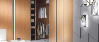
What color goes with maple or birch?
Light wood looks especially impressive against the background of contrasting walls. The spectrum covers almost the entire palette: red, green, brown, blue and shades of gray.
- Shades of Red: Saturated colors should be used sparingly, preferably as accents. With the right proportions, light wood harmonizes with rich shades of red and blue: red, burgundy and purple.
- Shades of Green: Fresh greenery on the wall combined with light wood brings life to the interior. Green with a grayish tint, such as the color of reeds, is also suitable here, creating a harmonious atmosphere.
- Brown and Blue: Painting your walls a warm brown color, such as mocha, combined with a soft blue, can create a cozy and natural interior that invites relaxation.
- Grey: Light wood and fine anthracite create a very strong but effective contrast. Complementary shades of gray bring contrasting colors together. The interior looks ascetic, stylish and cold.
What color goes with beech?
Beech has different shades: from yellowish to reddish. Therefore, beech wood allows you to create very different color combinations.
- Shades of blue: Beech wood goes well with walls in all shades of blue or colors with a high proportion of blue. In addition to fashionable shades of lilac and berry tones, beech harmonizes with blue and green. A combination of blue and green beech wood, such as mint, looks fresh and cheerful.
- Play of contrasts: Neutral light tones, such as sand, go well with rich colors, such as burgundy or bright greenery. As a result of this play of contrasts, a spectacular, dynamic interior is created.
What color goes with oak?
The calm color of oak is effectively emphasized by the cool shades of the walls. The interplay of cool walls and warm wood tones creates a working mood.
- Expressive and fresh: Dark, rustic oak tones are combined with bright red, purple and orange accents. Light yellow or light blue walls refresh the interior.
- Modern and Relaxing: If you want a calm, natural interior, choose mint or reed shades. The combination of fresh green with light gray or beige creates a positive mood and tones. Dark gray-blue shades look very modern.
An interior in brown tones will suit sociable, active people.
way of life for people. In such an interior they can truly relax
and gain strength for a new day. This color has a positive effect
impact during physical and psychological ailments.
Brown is one of the most natural colors found in nature. This is the color that represents the earth, trees, the color of stones and sand. It charges with the energy of nature, “grounds”, inspires a feeling of confidence and stability in everything, gives calm and tranquility. Brown symbolizes home and comfort in the home, and therefore is inextricably linked with ideas about comfort. This is perhaps the most universal and common color in interiors, popular and used always and everywhere. Sometimes we don’t even notice it or pay attention to it, because we are so used to it, but even now this color does not lose its relevance. Brown is noble, inspires confidence in the future and reminds of enduring values.
The art of use
Most often, brown color is presented in the interiors of houses and apartments on wooden surfaces (furniture, floors, window frames). A wide variety of tones and textures are popular here: from dark (wenge, rosewood, zebrawood, walnut) to warm, rich shades - cherry, mahogany and light milky - pine, ash. In wooden houses, brown is generally dominant. In such an interior, the main thing is to choose the right contrasting, bright combinations: with white, red, dark gray and black, turquoise.
Brown can also be used on large surfaces, but in this case it is worth choosing softer shades: coffee, cinnamon or ocher. In large volumes, pure brown color is overwhelming and looks heavy. Therefore, hanging chocolate curtains and placing dark sofas is only appropriate against the background of light walls - otherwise the room will seem cramped and gloomy.
Types of corrugated wood
Wood-look corrugated sheet is the most common type of decorative corrugated sheet with a pattern. Only in the Printech palette there are 20 colors, each of which imitates the texture of a specific type of wood or the type of its processing. There are seven more design options in the Ecosteel palette, if you consider the textured profile sheet as a separate color.
For comparison
If we take other types of decorative corrugated sheets, then stone-look corrugated sheets come in four colors, and brick-look profiled sheets are even smaller - only three textures.
All Printech wood textures with their official English names are shown in the table below.
The Russian translation is unofficial, so the name of the same picture in the catalog of different suppliers may differ greatly. Sometimes the Russian name for a texture has nothing in common with the English one, especially when it comes to trees, the wood of which is practically not used for finishing in Russia. Therefore, in order to avoid mistakes, when ordering a metal profile, either indicate the English or Russian name or the sample number according to the catalog of this particular supplier. Wood-look profiled sheet Printech - color options
| Image | Color name |
| Naive Dark wood | |
| Naive Multi Dark wood multi | |
| Naive Brown Brown wood | |
| Naive Maroon Mahogany | |
| Naive Natural Natural wood | |
| Naive Orange Orange tree | |
| Naive Burnt | |
| Naive 2 Beige W/S Contrasting beige wood 2 |
Click to see all colors (more 101
texture)
| Naive 2 Gold Multi Golden tree 2 multi | |
| Naive 2 Coral Coral tree 2 | |
| Naive 2 Brown Multi Brown wood 2 multi | |
| H-wood Peanut Light brown wood | |
| H-wood Walnut | |
| H-wood Cherry | |
| H-Wood Natural Light wood | |
| H-Wood Black Dark wood | |
| H-Wood Light Light-colored wood | |
| H-Wood White White wood | |
| H-Wood Royal Royal wood | |
| H-Wood Sienna Ocher wood | |
| H-Wood Coral Coral wood | |
| H-Wood D Orange | |
| H-Wood Dark Brown Dark brown wood | |
| H-Wood Skin Nude wood | |
| Log Board | |
| Log Dark Dark board | |
| Log Moisture Wet Board | |
| Wrinkle Log | |
| Log Multi Board multi | |
| Knal Wood Stained board | |
| Knal Wood Orange Orange stained board | |
| Knal Wood Cocoa Stained cocoa board | |
| Knal Wood Multi Stained board multi | |
| Oriental Oak | |
| Oriental Oak Orange | |
| Oriental Oak Castle | |
| Oriental Oak Peach | |
| Oriental Oak Burnt | |
| Red Oak Red oak | |
| Red Oak Light Light red oak | |
| Red Oak Coconut | |
| Red Oak Gray Red oak gray | |
| Red Oak Bake Burnt red oak | |
| Red Oak Natural Natural red oak | |
| Red Oak Sienna | |
| Red Oak Wine Wine red oak | |
| Red Oak Chocolate Chocolate red oak | |
| Soft Maple | |
| Maple Maple | |
| Maple Castle | |
| Walnut | |
| Cherry Cherry | |
| Cherry Yellow Yellow cherry | |
| Cherry Cordoba Cherry Cordoba | |
| Dark Cherry Dark cherry | |
| Caova Walnut Mahogany Walnut | |
| Caova D Brown Mahogany brown | |
| Zebrano Dark Dark zebrano | |
| Zebrano Gray | |
| Zebrano Pale (L) Pale zebrano | |
| Pine Wood Pine | |
| Pine Wood W/S Contrasting Pine | |
| Pine Wood Brown | |
| Pine Wood Black | |
| Old Pine Orange | |
| Old Pine Beige Beige old pine | |
| Old Pine White | |
| Old Pine D Beige | |
| Teak Wood Red | |
| Teak Wood Beige | |
| Teak Wood Brown | |
| Sycamore Sycamore (white maple) | |
| Sycamore Red Sycamore | |
| Sycamore Blush Pink Sycamore | |
| Sycamore Orange | |
| Water Ash Cocoa American maple (cocoa) | |
| Water Ash Dark Dark American Maple | |
| Water Ash Light Gray | |
| Water Ash Fir American Fir Maple | |
| Water Ash American Maple | |
| Water Ash Plain | |
| Noche New American Walnut | |
| Noche Gray American Walnut Gray | |
| Noche Caramel American Walnut Caramel | |
| Noche Coffee American coffee nut | |
| Conifer White White softwood | |
| Conifer Yellow | |
| Conifer Brown Brown softwood | |
| Royal Oak Beige | |
| Royal Oak Royal Oak | |
| Royal Oak Walnut | |
| Royal Oak Brown Multi | |
| Golden Oak Golden Oak | |
| Golden Oak Multi Golden Oak Multi | |
| Golden Oak Dark Dark golden oak | |
| Sweet Oak Beige | |
| Sweet Oak Burnt | |
| Sweet Oak Red | |
| Sweet Oak Dark Dark jagged oak | |
| Acasia Brown | |
| Acasia Burnt | |
| K Wood Wood loft | |
| K Wood Multi Wood loft multi | |
| K Wood Maroon Chestnut wood loft | |
| K Wood Burn Scorched wood loft | |
| Engineered Wood Old painted board | |
| Engineered Wood Yellow Yellow old painted board | |
| Crack Wood Cracked Board | |
| Spalted Wood Rotten board |
From this palette, the material most often used is four colors: “Dark Wood” corrugated sheet, “Light Wood” corrugated sheet, “Raw Wood” corrugated sheet or “Raw Wood” and “Mahogany” corrugated sheet. All popular textures, except untreated wood, look good when decorating houses, constructing outbuildings, and building fences. Metal profile-imitation timber is mainly a material for cladding buildings. It is too light for fences - dirt and dust are clearly visible on it, so it is rarely used for the construction of fences.
Unlike Printech, Ecosteel is a Russian brand, so there is no confusion with the names.
But here is another subtlety: despite the same name, the usual glossy or matte and textured colors are different designs. Wood-look corrugated sheet Ecosteel - color options
| Image | Color name | Type of coverage |
| Bog oak | Glossy, matte | |
| Golden oak | Glossy, textured | |
| Maple | Glossy | |
| Cedar | Textured | |
| Pine | Glossy, matte, textured |
In the case of Ecosteel, the most popular colors are “Stained Oak” and “Golden Oak”. Essentially, this is the same profiled sheet “Dark Wood” and “Light Wood” in the Printech palette - the difference in textures and colors is minimal.
It’s also worth focusing on textured colors. The cost of wood-look corrugated sheets with imitation texture is higher than a regular glossy or matte sheet, but the effect is worth it. Especially when decorating a house. If in doubt, simply ask the supplier for a glossy and textured sample of the same pattern, and then compare the two. Try not to make a decision based on the catalog - the colors look completely different in person.
Top ↑
Combine and experiment
Despite the fact that many people like bright and bold combinations in the interior, as a rule, when it comes to the color scheme of their home, few decide to experiment, and the result is the beige-brown interiors that are so familiar to us. Some may find this boring, but you need to look a little more broadly. If you use noble deep shades of brown: dark chocolate, wenge, coffee and cinnamon, various textures and textures, soft natural fabrics - the monochrome, at first glance, interior will sparkle, be filled with volume and luxury. Don't forget that brown shades go well with many colors.
| The most successful and fashionable combinations of dark brown are with piercing turquoise and blue tones. Such an interior will look cheerful and elegant, since light blue colors neutralize some of the gloominess of the main color. This could be a monochrome interior with light blue accents in fabrics and accessories, or, conversely, a white and blue room with deep brown accents in furniture or flooring. |
| Since by its nature brown is obtained from a mixture of 2-3 spectral colors (red and green or orange with blue or gray), it goes well with them and with all their shades. These colors bring dynamism to the calmness of brown, and themselves reveal their depth and content against its background. |
| And light brown shades look good with warm related tones - orange, red, yellow. |
| The natural brown color of the wood goes very well with white. Moreover, brown can also be the main color - golden-ocher walls, rich brown shades of wood (wenge, walnut, rosewood) furniture and accessories, and white floors and ceilings will add liveliness and balance it. The result is an incredibly deep and sophisticated solution. |
Most often, brown is found in the interior as a good, deep, rich background, diluted with bright accessories. It is equalizing, which is why it is used to balance different colors in a space.
Monochrome brown shades in the interior: beige cream walls in combination with dark floors and furniture, dark accessories, medium tones (golden ocher, terracotta, coffee) in furniture upholstery and curtains will create an interior filled with nobility, warmth and comfort, and such decisions are always relevant.
In general, brown provides great opportunities for experimentation.
Color characteristics
When choosing a color, you should decide what task the fence should perform:
- get lost and merge with the landscape;
- be original and unusual;
- isolate the area from the environment.
Color options for the fence can be as follows:
- White color. Visually expands the space, is associated with cleanliness, light and order, and goes well with bright greenery. Cool spectrum color.
- Grey colour. A fairly ordinary color that visually increases the area of the site.
- Brown color. A warm and natural shade that goes well with plants and trees and almost any façade.
An example of brown color in the design of a fence
Premises map
Brown - the color of chocolate, coffee, cocoa, cinnamon - is a very “delicious” color, which is why it is so often used in cafes, restaurants and other public institutions. In combination with vanilla beige shades, it immerses you in an atmosphere of incredible coziness and warmth, comfort and ease of perception. Interiors in brown tones are very popular, they are neutral, never get boring and you don’t want to leave them for a long time. If brown is used in office interior design, it helps maintain a sense of stability and create a positive image of the company.
Brown color helps create an atmosphere of harmony
and peace. Design studio "Understanding"
Cream is ideal for home cooking, as most people perceive it as warm and delicate. This classic shade promotes a good appetite, especially if it is close to light brown. Cream can also be used in kitchen accessories - from porcelain dishes to small items.
Dark brown wood floors, furniture, paneling and furnishings will add warmth to your living room. It will be a pleasure for family and friends to stay in such a room. She will look noble and elegant. In such a room it is pleasant to sit with your legs crossed in a cozy chair with your favorite book in your hands. If an excess of dark brown tones overwhelms you, then you can use the colors of precious stones - amethyst, garnet or emerald - as complements.
In this living room, brown is presented in all its glory: golden brown,
terracotta, sand, dark chocolate color. Design studio "Understanding"
In a bedroom decorated in brown tones, you will always feel completely safe. Cream has a soft effect, expands space, makes it easier to perceive reality, and gives confidence that everything will be okay. It is perfect for the bedroom. And the golden-ocher shades of the textiles fill it with a feeling of sun and give it a warm, cozy look.
Beige, peach and café au lait look beautiful in bathroom decoration, especially if you complement the design with darker details. Interestingly, depending on the shade, taupe can be the most dramatic of neutral colors. Wine red or gold look great against a taupe background. This combination will be a pleasant surprise for your guests.
In the color scheme of the office, a harmonious combination of warm and cold tones is desirable. Combinations of dark blue and dark brown, tan and beige with small splashes of accessories in bright red or dark burgundy colors are considered successful options. Furniture in reddish brown or dark brown is ideal for a classic-style office. Reddish-pink accessories and details, such as a lampshade or curtains, with a dominant chocolate or dark brown color will make the atmosphere of the office less serious and tense and will help the birth of important and correct decisions.
It is not recommended to use brown color in large quantities in children's interiors. If only the lightest colors, combined with fresh shades of greens, yellows and oranges, as well as various warm shades of wood in furniture.
Brown, due to its naturalness, loves warmth. Therefore, the lighting should generally be chosen as warm: soft fabric lampshades that provide diffused light, a warm fire from the fireplace... What could be more cozy and peaceful. In more laconic style solutions, you can use cold lighting. In this case, brown will look more fresh and invigorating. This option is more suitable for workrooms and various office spaces, although it can also be used at home - it all depends on your preferences.
Contrasting white elements highlight the brown base. Design studio "Understanding"
Design
As a rule, in the process of arranging living rooms, this color is chosen by people with an active lifestyle, who mostly live by emotions. At the same time, a modern interior in red colors will fill the interior space with passion and positive energy; such a design will stimulate mental and physical activity, toning the human body. Shades of red can make the atmosphere of a room more lively and festive, lifting the mood of those around you and filling the space with warmth. This color is the choice of real leaders, people who are completely confident in their abilities.
Different shades can be found inside a house or apartment in different places:
- In the hallway and hall;
- Toilet and bath;
- In the bedroom, especially for young couples. In this case, bright colors will charge the room with positive emotions and passion;
- A nursery where a low-active child lives. Here, red will help the baby increase activity, improve attention, and also develop leadership qualities;
- In the living room, if you hold frequent special events, friendly gatherings and parties in it.
It is worth noting that today experts identify a large number of different shades of red, each of which has its own impact on the psychological state of residents. Moreover, the brighter the color, the more aggressive it is considered: in the interior of such rooms, interlocutors open up better to each other, communicate more emotionally, and argue much more often.
Important!
If your child is overly emotional, then using red in the interior of the nursery will be a big mistake.
However, this color scheme also has the opposite effect, which consists in emotional breakdowns and nervous disorders if you overdo it. This is especially true for people who are under stress. Also, you cannot use this color scheme when decorating a bedroom where an elderly couple will live, in a recreation room, library, office, etc.
If you are eager to use red in the interior of the room, then you can also use restrained and calm colors as alternative colors that will be less aggressive and bright:
- Salmon, tomato, rose-red, pale coral;
- Bordeaux and wine;
- Terracotta and brick.
The listed shades can easily be combined in the interior with other colors, creating an expensive, elegant and noble look. And although they are not so active, they still sufficiently tone a person, giving the room greater comfort and warmth. With their help, you can successfully furnish almost any modern room, regardless of its purpose. Finishing materials may include terracotta tiles, mahogany or brick.
A little advice!
For the design of public spaces, be it a cafe, club, hotel, fitness room or restaurant, a red design is much preferable.
Style load
The most noble and deep brown looks in the classic style. Since ancient times, rich luxurious houses have had wooden and leather elements in brown tones; this has always been a sign of special chic and sophistication. The use of brown in ethnic interiors has also become widespread. In the Japanese style, where the main principles are functionality and comfort, brown is always appropriate: the color of reeds, wood, rice paper. In the Chinese style, more saturated shades are used - red-brown, terracotta, combined with bright red and gold.
Brown in African style appears colorful and textured. Various natural materials characteristic of this style, natural wood textures (rosewood, wenge, sandalwood, ebony and mahogany), cotton fabrics, carpets imitating animal skins, clay vases, warm terracotta, golden-ocher shades of walls, rattan furniture - everything this helps the brown to reveal itself in all its glory.
But brown also fits perfectly into modern style trends. It adds warmth to cold, restrains the clarity of minimalism, softens industrial and balances eclecticism.
The material was prepared by Ivan Frain. We would like to thank Ekaterina Komanina, chief designer of the Ponimanie design studio, for her help in preparing the material.
Interior projects using brown:
Mahogany is the color of elite wood varieties. The combination with it is close to the combination of burgundy. Its meaning, application in clothing and interior design.
The name of the color speaks for itself - it is the color of wood, but not just one species, but a whole set. The red hue is the unifying factor. The brightest color is the most valuable.
The fashion for products made of red wood began in England at the beginning of the 17th century, and at the end of the 18th century its popularity gained full strength. Interiors in the neo-empire style were an example to follow. The import of bright varieties of trees has reached an unprecedented scale. Since then, the idea of woody red has always been associated with a feeling of luxury and aristocracy.
Mahogany shades in the Pantone system for textiles occupy the line between red, brown and orange. In the palette of wooden coverings it is more often called.
Mahogany color matches
with dark orange
(2), creating a soft, velvety combination. It brings out the warm notes of mahogany. You can easily combine tones by changing the size of the “spot”.
with green tea color
(3) – contrast of complementary colors, green tea is refreshing, but the combination is harmonious only if green is a modest addition or it is diluted with a neutral, for example, light beige.
You can complement the range with warm light and medium pink, as well as cinnabar.
Mahogany color combination table
- this is a combination of similar shades, it is harmonious and unobtrusive, built primarily on light contrast. The palette is composed of white-lilac, lilac, sakura, fuchsia, dark purple.
- a combination of colors of the same range with not a large difference in lightness, but different undertones, which gives it a “zest”. It involves dark red, alizorine, terracotta, coral, and dark burgundy.
- orange, like pink, is related to it, and if the first one pulls the shade towards red, then orange emphasizes its note in it. Consider pairs with light peach, pumpkin, sea buckthorn, red, and copper.
- a contrasting pair, where the latter is much lighter than the first. Since yellow is a warm tone, the whole combination raises the temperature. Combine gray-yellow, champagne, wheat, dark yellow, golden oak with the main tone.
- calm, colorful, natural colors. Green, as a complementary color to red, enhances its properties, and the soft shades we selected, such as avocado, fainting frog, swamp green, olive, pine, do not irritate, but are harmonious.
enter into thermal contrast. Due to the similarity with the complementary color, the pair looks expressive and effective. The palette includes light gray-green, wormwood, gray-green, emerald, and malachite.
Mahogany and blue, light blue
- this is the contrast of cold and warm. It can also be joined by the expressiveness of light and dark if the pair includes blue. The gamma is made up of blue sky, gray-blue, black sea, blueberry, thunderstorm.
- a medium-expressive pair, since the shades are similar and are on the same line of lightness, but even purple adds a certain mystery to the combination. consider pairs involving lilac-lilac, gray-lilac, gray-violet, charoite, violet-black.
- a successful, discreet, but expensive and harmonious combination. Brown makes the base color rich and emphasizes its complex nature. Combinations with the color cocoa with milk, cappuccino, dark chocolate, dark chocolate, and black chocolate will be beneficial.
Mahogany and neutral color
These include white, beige, gray shades, which ideally set off the deep dark red color. For example, a palette of ivory, papyrus, gray-lilac, anthracite, lead.
Mahogany color in clothes
If you have red hair, or have a red tint, and your face has a warm yellowish tone (), then this is your color scheme.
The color of mahogany is slimming and well masks figure flaws (naturally, with a successful cut), making you bright and majestic. It will look good in woolen items, silk blouses and cotton items. Evening dresses will look great.
Dark orange complements the mahogany tone: use a suede cropped jacket with a dress, suede shoes or a handbag. You can choose gloves, shoes and a handbag for a mahogany-colored coat.
The green tea shade is refreshing and calming next to the base tone. Use it in “smooth” elements: silk, stones in jewelry.
In addition, mahogany is suitable for representatives of the “summer” color type - as a complex, dark, multifaceted tone.
You can combine mahogany with many shades in clothes. Classic pairs are with black, white, gray (silver), beige, brown and strict dark blue. Combinations with yellow, red, pink, and green leave vivid impressions. Let's see how these combinations look in your wardrobe.
Mahogany color in the interior
Mahogany is intended for pathetic, majestic interiors. It can be English style, Empire style, even Baroque.
These styles require appropriate furniture: carved arrays with smooth curves and intricate patterns.
Use textured materials with a complex, monochromatic pattern. On the floor, in this style, there should be carpets.
For wall accessories, it is better to use paintings from the era of realism, in warm colors.
Examples of interiors using mahogany color:
What color scheme to choose for the kitchen? How to choose colors? You've probably asked yourself this question when planning your renovation. Many people prefer to “play it safe”, preferring pastel colors, discreet wallpaper and wood. But is it worth avoiding the pleasure of making a kitchen not according to the model that you are used to seeing, but the one you have always dreamed of? Perhaps it wouldn't hurt to freshen up your colors to get some inspiration for creating new culinary masterpieces.
Stylish, strict, “cuisine with a masculine character. The classic combination of black and white, the cold shine of metal.
Strict gray countertops contrast with the doll-pink color of the furniture. The result is a stylish and unusual kitchen.
Principle of contrast: light wood color combined with a darker reddish tint.
Gray combined with purple is a practical, but at the same time very aesthetic option.
Forget-me-not blue color looks gentle and at the same time bright. It goes best with white in the interior.
You won’t get bored in this kitchen! Dark red and apple green are a bold, but at the same time very beautiful, “tasty” combination.
Monochrome kitchen in a modern style. Those surfaces that most often get dirty in the kitchen are made in dark gray, which will save you from daily cleaning
Another example of a successful combination of green and red, complemented by light wood and amber-colored lamps
Notice how fresh the purple kitchen looks, complemented by light wood and bright green accessories
Two shades of yellow, complemented by white and red, will warm you up even on the dullest winter day. A color combination conducive to delicious cooking!
Bright green and wood brown colors in the kitchen create the illusion of a summer day in the garden
A muted shade of green and black and white checkers on the floor: an option for businesslike and discreet people
In a kitchen with a “traditional” white and brown color scheme, a bright accent – for example, a purple table – wouldn’t hurt
Colored tiles refresh the kitchen interior, where cream and gray colors dominate
Dark brown, cream and white colors in the kitchen interior are reminiscent of sweet cakes and delicate cream. This kitchen can be complemented with small accessories in bright colors.
White, red and black are a win-win combination. But remember that too much red is tiring.
The color of natural wood (furniture) and beige (walls) is a classic combination that will never let the kitchen owner down
Bright yellow chairs in a black and white kitchen look very bold, on the verge of kitsch. Try experimenting!
Considering the specific nature of the kitchen as a place for cooking, it is important that the surfaces are not too dirty. So, many are tempted to make the kitchen entirely white; designers also love it; but before that, think about it: are you ready to clean it every day? Another thing is to combine white with other, less demanding colors - for example, gray, sand, beige or brown.
Since the kitchen very often serves as a dining room at the same time, it would be wise to use colors that stimulate the appetite - bright red (the color of watermelon, tomato and strawberry), yellow (banana, lemon), orange (orange). But keeping the entire kitchen in the same bright color is tiring for the eyes, so it is better to use such shades in doses, along with more neutral colors, for example, gray, white or black. For example, one of the walls may be red or orange.
The kitchen is divided into two zones - working and dining - with different color combinations. The dining room looks warmer.
Patterned ceramic tiles combine three colors at once. The rest of the space is quite neutral.
Different shades of green also look appetizing - light green, bottle green, apple green. In addition, green looks calmer and does not excite the nervous system as much as, for example, red, and goes best with natural stone and wood. If you want to make the interior of your kitchen more extravagant, then try combining dark green or light green (for example, on the floor and walls) with bright red (doors of kitchen modules, accessories). Your kitchen will “sparkle”!
A black kitchen is not an option for everyone. To avoid getting bored, use accessories or a bouquet of cheerful flowers
Three shades of turquoise in the kitchen are a great option for lovers of summer and sea freshness. As in nature, “sea blue” is diluted with white “foam”
By combining several shades of the same color (in this case, gray), you can get a very good result
A strip of bright scarlet tiles against the backdrop of a restrained white and gray kitchen space looks impressive and “expensive”
Black armchairs in this minimalist white kitchen help avoid the feeling of boredom. After all, the most winning combinations are based on contrast
Lovers of the strawberries and cream dessert will be delighted with the pink and white kitchen. And the laconic design reliably protects it from suspicion of vulgarity.
Pastel colors will always be the most popular colors to use in the kitchen due to their versatility. And dishes in cheerful colors will create the right mood.
Add some sun to your kitchen interior! Yellow looks great with all the primary colors and energizes the kitchen owner in the morning.
Blue is the color of sophisticated romantics, but too much of it can cause melancholy. With white and pale blue, on the contrary, it will delight you
This kitchen features different shades of red, from mahogany to brick.
Did you know that cool blue looks great with yellow, like the sky and sun? Pay attention to the tiles on the floor!
The pale green color looks good in the kitchen and matches natural wood. But this kitchen still lacks color accents
If you prefer moderation in food or are generally on a diet, you may be interested in cooler colors - blue, purple, turquoise. A combination of turquoise and fuchsia (also a cool shade) will be very exotic and at the same time beautiful. Cool colors promote relaxation and rest, while their richer shades are refreshing, which is important, for example, in hot climates.
White color is beautiful in itself and great in combination with all the others, but it is very capricious when it comes to cleanliness in the kitchen
Light yellow walls and white furniture are a common color combination in France. It looks elegant and at the same time cozy.
The stunning azure color of this kitchen is “diluted” with a white ceiling and natural wood laminate
Mahogany, wenge, oak and pine logs - different shades of wood brought together
Pale blue walls are complemented by mosaics and decor in different shades of blue, making the kitchen look very fresh.
This kitchen combines two shades - warm canary and fresh lime.
Blue and yellow tiles on the walls look bright and unusual, but brick-colored furniture is not the best combination for it
Blue and orange are a classic combination according to the color chart. But not everyone has the courage to use it
Pastel shades will be in place in any kitchen, such as pale yellow - the color of vanilla pudding
The rich red color seems to give a command to eat and looks great with natural wood.
The combination of two shades of turquoise looks good in the interior of any style, and the inscriptions make it more fun
But you can combine the colors of both gamuts with each other - for example, the hottest orange and the coldest blue. A table of color combinations used by artists will come to your aid. According to this table (sometimes depicted in the form of a circle), the best combinations are those colors that are either nearby (blue - lilac, pink - red, yellow - lime), or directly opposite, that is, contrasting.
A color scheme
Since we're talking about color, let's quickly see what colors pine furniture goes with. In the photo below you see one of the most unfortunate examples.
Here, pine furniture is placed against the background of walls of a rich golden color. The result is a visual mess - the beauty of the heterogeneous golden wood does not appear at all and dissolves against the background of the walls. Compare with the photo below:
Everything looks equally good on both pastel and rich backgrounds.
The photo above clearly shows that pine furniture goes well with all the rich, simple colors from the summer palette. In general, the less processed the wood is, the better its natural golden color is preserved (without processing at all or under transparent varnish), the more compatible it is (see photo above), the more tinted it is, the more difficult it is to choose a background (see photo above right).
And, of course, pine looks great on a white and cream background, as you will see in the following photos.
But complex, heterogeneous, dusty, powdery, aged colors are bad partners for pine furniture .
You can see this in the photo. Look how gorgeous the buffet is, but how it plays out against the equally gorgeous backdrop of the antique sand wall. Two heterogeneous objects placed nearby often cancel each other out, which is what happened here.
Compare this to how the sideboard contrasts beautifully with the rich terracotta colored floor.
Pine furniture is suitable for either soft pastel or rich colors . In other words, it should stand out against the background, and not disappear into it.