Green in the interior
It is called the color of nature, rebirth, youth, growth, coolness, purity, safety... And all this is about it - about green. Green is one of the three primary colors, consisting of blue and yellow. The more yellow, the warmer the green; the more blue, the colder it is. A huge number of different shades of green are found in nature: forest foliage, dried greenery, sea wave, emerald, malachite, vegetables and fruits, swamp mud... Since green color constantly surrounds us, it is considered the most familiar to the human eye, and therefore the most relaxing and calming. This explains the frequent use of green when decorating walls in public spaces - kindergartens, schools, hospitals, offices, etc. It is worth remembering the colors of the traffic lights: green is a safety sign.
Green color: influence
If there is a lack of harmony in a person’s life, the color green in the interior where he lives and works will help him achieve harmony with himself and the world around him. In a green room it is easier to cope with negativity - anger, imbalance, irritability, stiffness. In a green place it is easier to overcome an attack of claustrophobia, because this color is a symbol of nature, that is, open space and fresh air. Therefore, green, along with blue, is recommended for decorating small rooms.
The warm pastel shade of green can be relaxing and even act as a mild sleep aid. Cold, juicy green, on the contrary, mobilizes and provokes activity. Remember: in hospital wards you can often see light green walls - the person’s eye does not strain, and a feeling of peace arises. But the cloth that is used to cover, for example, card tables is a rich, dark green color, since not only peace, but also concentration is needed here. Thus, by changing shades, you can adjust the influence of color.
No less interesting combinations
Here are a couple more tips regarding combinations of shades of green with other colors in the interior:
- Rich blue harmonizes with pistachio.
- Light blue or sky blue - with fruity shades of green.
- Soft blue or green - with accents of yellow and smooth transitions of turquoise.
Now it becomes clear what color green goes with. The photo below is a vivid example of a harmonious combination of colors in the interior.
Green interior: in what rooms is it appropriate?
In general, it is believed that green is a good color for absolutely any premises - both residential and work. However, it is important to choose the right shade.
Green living room
If you use too much green in the living room, the atmosphere will be relaxing. Even if these are cold, rich shades, there will still be a feeling of lethargy, passivity - at least physically. Therefore, for living rooms where guests are received and parties are held, green is not a very suitable color - it is better to introduce it as accents, but not to use it as the main color. But for small living rooms, which are used primarily for relaxation, choosing green would be the right choice.
Green room for children
Pastel green is a good choice for the room of a hyperactive toddler or teenager. In the green room he will calm down and tune in to intellectual leisure. That is why green is recommended for finishing and decorating the room of a child who has learning difficulties. This color should also be chosen for those rooms in which classes are held in kindergarten.
A melancholy, passive person in a green room will become even more relaxed. If you want to activate your child, make him more active, emotional and talkative, choose a different color - pay attention to warm, but quite bright and cheerful shades of red and yellow.
In any case, an excessively large amount of green in a nursery is not very desirable, since any child will become bored in it. Choose one thing: either decorate the walls with green, or use green in decor, textiles, and furniture.
Green bedroom
Since green relaxes, acting as a mild sedative and sleeping pill, it means it is optimal for the bedroom. However, not all tones are suitable: choose pastel shades, that is, light, very light, even translucent - green tea, light pistachio, soft olive, protective, mint, etc. It is better if these are matte surfaces. Juicy herbal, emerald or jade color should be introduced into the bedroom only with small accents. Rich blue-green, close to the color of sea green, can be used more actively in the bedroom, but not excessively, otherwise the atmosphere will be more tonic than relaxing.
The bedroom, whose windows face south, can be stuffy, hot and too bright. Using a cool green-blue shade to decorate large surfaces will create a feeling of coolness. A dark, cool shade will “absorb” an excessive amount of sunny color. Thus, a bedroom in green tones of the cold part of the spectrum is a solution for southerners. Northerners should give preference to those shades of green in which yellow predominates (lime, yellow-green).
Green color in the interior of a home office
As already mentioned, darker, richer, richer shades of green encourage mental activity and help you make decisions quickly. For offices, green in a checkered pattern is good - such a design will invigorate and stimulate logical thinking. The combination of green, gold and noble wood colors will bring features of luxury and respectability to the office. It is better if it is a complex natural color - for example, malachite, moss, etc.
Green color in the interior of the hallway
Green is the color not only of nature, but also of money, which is why it is often chosen for receiving financial companies. According to psychologists, a green hallway in a house will create a similar mood: in this house the walls are the color of money, which means successful people live here. In the hallways of apartments, as a rule, there are no windows. Therefore, light walls, a lot of light, and mirrors are preferable here. Choose paint or wallpaper that is a light, soft green color. Stripes that are good for hallway walls are green-white, green-beige, etc.
Green bathroom
Various shades of green are very often chosen for bathrooms, because green is associated with nature, and one of the main natural elements is water, which also reigns in the bathroom. However, designers don’t really like to use this color for the bathroom, because it itself is “damp”, so in a green bathroom there can be a feeling of dampness, wetness, and coldness. Don’t forget that green evokes associations not only with the purity of nature, but also with rot and mold.
It is worth using a combination of green with other colors for the bathroom - beige, cream, white, blue. For a marine-style bathroom, choose not pure green, but a color close to the color of aqua; decorate the room with marine accessories, apply a wavy pattern to the tiles, hang a round mirror resembling a porthole on the wall - in this case, the right, positive associations will arise, referring us to the seabed or to an expensive resort, and the green bathroom will be transformed.
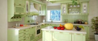
Green kitchen
In the kitchen, green is used less often than in others, since this color can rarely be called appetizing and tasty. A completely green kitchen (green floors, walls, furniture fronts) will be uncomfortable, and your appetite may decrease.
Take green for one thing - for example, for wall decoration and accessories or just for facades. Combine green in your kitchen interior with sand (a reference to the Mediterranean and eco-style), orange (fresh citrus), beige, brown (natural style) and yellow (the color of fruit - this combination will increase your appetite). You can do it with red too, but be very careful, just like with purple.
A color scheme
Of course, no one wants to do the interior in one color. Multiple tones will always be used for this. Let's take the most common color combinations with green and see how well they fit into the design:
- Green color in the interior in combination with red is a very “tasty” option. Despite its extraordinary brightness, this is a very natural duet. It is associated, for example, with a ripe strawberry located on the grass. In an apartment, this combination is not suitable for any room, because in the bedroom, too bright colors will interfere with rest. But in the living room or kitchen, a green and red design will look simply great, very festive and rich. When using these colors, you need to remember the main rule: green as the main tone, and red for placing color accents.
- A green interior with the addition of blue is very harmonious, because this combination reminds of a cloudless blue sky and a spacious meadow. By playing with shades of these colors, you can apply them in all rooms. For example, light green with turquoise will decorate a child’s bedroom very well. In any case, a green-blue interior will make even the smallest room spacious and airy.
- Continuing the idea of associations, we can assume that green and yellow resemble a forest clearing on a sunny day. This color combination is very pleasing to the eye. A person in a green and yellow interior feels relaxed and calm. In addition, it will be very successful to use the warmest version of yellow – orange. A green-orange interior will be no less rich than a green-red one.
- The combination of green and brown is one of the most successful. The advantage of a brown tone is its naturalness, so with the help of a green-brown design you can create a real eco-interior. In any case, the advantage of the green-brown combination is that it can be used in any room.
- Green color in the interior interspersed with purple is a rather bold combination. In general, designers rarely use purple tone, because it is very complex. However, green shades hide its excessive brightness and make it suitable even for the bedroom. Also, if you want something simpler, you can always use similar tones to purple - pink and raspberry. There are no restrictions in their combination with green.
Green interior: choosing a shade
You need to choose a shade depending on the functional purpose and style of the room.
Oriental interior in green tones : here green is also used very actively. Pay attention to the shades of natural stones - malachite, jade, emeralds, as well as olive and khaki (protective). In an oriental interior, combine green with various shades of yellow, including gold.
Tropical interior in green tones : if the interior should refer us to the hot tropics, it is worth arming yourself with a light green or pistachio color, combining them with sand. In such an interior, one cannot do without the use of wicker furniture, a huge number of living plants, palm trees in tubs, and “tropical” decorative items.
Nautical style : soft green and aqua are colors for walls, textiles and decorative items in a nautical style.
Art Deco style : such interiors often contain dark, rich shades of precious stones (jade, emeralds, malachite). Expensiveness, chic, monumentality - this can be achieved by combining “expensive” green shades with the color of metals - white and yellow.
Ecostyle. It is difficult to imagine a natural interior without green. However, it is still better to introduce rich dark green tones with accents: live plants, sofa cushions, decorative items. For walls and floors, light grass tones are more suitable, as well as shades of green tea, September grass, swamp mud, etc.
Furniture
Furniture for a green living room should not be the same color as the walls. The classic choice for such a room is white furniture: table or tables, chairs, upholstered furniture. All furniture does not have to be the same color. A combination of several non-contrasting colors is possible.
It’s not bad if one color or shade is used in the decoration of several interior items. For example: the upholstery of chairs matches the curtains and primary colors of a modular picture placed on the wall, or the color and texture of the fabric upholstery of chairs is repeated in decorative pillows scattered on the sofa.
The material for finishing upholstered furniture can be anything: various types of fabric, as well as the most win-win option in almost any interior - leather.
Natural wood furniture will look good in a living room interior in green tones.
It is convenient to use modular furniture to decorate a living room in green tones, which can be either green or other colors. It is easy to move such furniture to another part of the room, replace one element with another, and experiment with other colors of the modules.
What to combine green with in the interior?
Cool green-blue shades go well with yellow, lemon, orange, light peach, and delicate pink. In addition, a combination with snow-white and light wood colors can be interesting.
Blue-green shades are “friends” with white, sand, yellow, blue, blue.
Pastel tones of cool green make a good combination with pearl and silver shades of gray.
Combine rich green tones, both dark and light, with white (classic combination), yellow, and brown.
Design tips for interior design
Green, like no other color, is rich in shades. That is why it is quite difficult to give universal advice on choosing a tone, however, experts recommend adhering to the following rules:
- If you are planning to create a living room design in green tones to enjoy peace, coziness and comfort, give preference to calm and light colors.
- Those who dream of turning their living room into a lush hall for entertaining guests should add rich shades of greenery to the interior, for example, bright green or emerald green.
- Do you want a riot of colors? The life-affirming color of lime will help you solve this problem.
- Your room will find an organic combination of elegance and comfort if you choose neutral shades - maple green or soft olive.
Designers warn about common mistakes when creating a living room interior in green tones. We recommend that you pay attention to them:
- In order not to turn the living room into a gloomy and faceless room, use shades of green in doses.
- Do not paint walls and ceilings in bright colors.
- When decorating a small living room, avoid dark shades. Your task in this case is to give the room lightness and airiness, and only light tones of greenery can solve this.
Green needs partner colors. It goes well with gray and white (milky), gold and blue, brown and beige, yellow and peach, turquoise and blue, sand and almost all wood shades.
View gallery
Using the example of one of these combinations, we suggest considering the features of decorating a living room in green tones. We hope that you find some ideas interesting and you want to use them in your room.
Green interior: benefits
- It rests on the green surfaces of the eyes. If your eyes are tired, look at green and you will feel better. Place your computer desk against a green wall or hang a poster above the desk with a picture of, for example, a green forest. Or make an original note board, covering it with fabric in a pleasant green color for you. Hang the board above your desk and occasionally look away from your monitor and look at it for a couple of minutes.
- It is believed that green color in the interior helps strengthen the immune system. Choose green to decorate the nursery of a sick child. Cover the bed of a sick person with green linen. For the winter, place a floor lamp with a green lampshade in your bedroom.
- If the room is constantly hot and stuffy, give preference to a cool blue-green shade for wall decoration - in a green interior you will feel lightness and coolness.
- In the children's room, parents often hang the alphabet, numbers and other educational pictures on the walls. It has been proven that children perceive and remember graphic information better on a green background. Make one of the walls in the nursery or part of the wall green (highlighting it, for example, with a frame of polyurethane moldings). Green walls or a section of one wall will become a kind of “blackboard” that will increase the efficiency of the “learning process”.
Green interior photo
Click on the photo to view it in full size: