Choosing a color scheme depending on the purpose of the room
The selected combinations and density of colors depend on the characteristics of the room - spacious or cramped, high or low ceiling, windows facing north or south. And also on the functional purpose: with what it is customary for a family to combine a living room - with a dining room, with an office, with a guest bedroom.
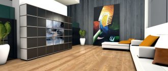
If the living room is used only for its intended purpose or simultaneously serves as an entrance hall (entrance hall), the preferred color scheme is beige, cream, wood shades. Decorative lamps will enhance the feeling of warmth and comfort and add a few bright touches to the liveliness.
The living room, which is used as a study, can be decorated in English style: muted green and brown tones, furniture with leather upholstery. Likewise, if a home library or bar is located here.
In the living room, which is used as a dining room, “food” colors would be appropriate: caramel, chocolate, coffee. Furniture with the texture of natural wood and cream upholstery is desirable here. For contrasting fragments, it is recommended to choose materials in the yellow-orange range: lemon, orange.
A combination of three colors looks good in the living room: white, brown, beige. With brown it is better to use not a snow-white tone, but “edible” shades: cream, milky. Possible colors for furniture upholstery are apricot or peach. Options for dark inserts - emerald, cherry.
It’s better to have a matte white ceiling: you shouldn’t make it dark in principle, it looks low and overpowering. If there are a lot of thick brown colors in the room, it is not advisable to use a glossy stretch ceiling: it will reflect the interior and look dark. For the same reason, you should not use a ceiling made of mirror panels.
In combination with dark walls, do not install stained glass windows - they have less translucency. It is advisable to laminate window frames (if they are plastic) either monochrome brown or wood-like - the same color as the doors.
Children's room in green tones: room design styles
Of particular importance in the interior of a nursery is the color of young, awakening nature – green. Since ancient times, it has been famous for its positive characteristics and pleasant design. As components of the green color, blue and yellow each bring their own influence to it: yellow – positive energy and cheerfulness, and blue – calmness and harmony.
A room in green tones will fill a child’s life with bright positive colors and emotions. The right combination of green with other colors will allow your baby to live in a fully harmonious atmosphere.
In addition, there are many shades of green, and options for decorating a room in green. By giving free rein to your imagination and remembering your childhood, you can decorate your child’s space in one of the interesting children’s styles, or the style of some character.
- If you have a little princess, then her home can be decorated in the spirit of fairies from numerous fairy tales on this topic;
- Pirate style can perfectly include the green expanse of the sea;
- The bright forest edge is suitable for children of any gender;
- Menthol color will look great in a children's room for a girl, decorated in Provence style;
- In the thicket of a green forest, little gnomes or elves will look great;
- Light green is perfect for an unusual style in the spirit of a spaceship.
The combination of light green and pink will create a fabulous and unusual interior in a nursery for a little girl. For older children, green is perfect for decorating a room in Art Deco, Scandinavian, rustic and classic styles.
Materials and design
The living room in the spirit of classicism categorically gravitates towards natural and expensive materials: marble and granite, other rocks, valuable types of wood, bronze, copper, gilding, velvet and silk, inlays and precious metals.
Floor finishing
For a classic living room, there is no better choice than graceful and elegant artistic parquet flooring. A touch of antiquity, abrasions, and small defects will give it a special sophistication. Moreover, the living room is one of the few rooms in the house where it is really advisable to use natural parquet.
If you prefer more modern interpretations of style or don't want to sacrifice practicality, choose laminate. Nowadays there are a lot of collections that imitate any other materials, textures and patterns. An even more radical alternative is stone slabs or porcelain stoneware.
Wall decoration
In the living room, feel free to take all those wall coverings that are not suitable in the kitchen or hallway. For example, these are paper or textile wallpapers - a combination of natural textures with ornate patterns
Pay attention to wood paneling, tiled mosaics, or combinations of several different materials at once.
Ceiling design
Popular stretch ceilings are not very appropriate in classic interiors, but complex plasterboard structures are easy to use in different ways. If you still choose PVC film, take a satin or matte fabric. And if the even base of the ceiling allows, it is enough to simply whitewash or paint it.
How to make the interior more interesting?
The beige color is not used alone in the interior of a nursery, because it makes the room boring and monotonous. But everything can be fixed, since perfect harmony can be achieved using various materials, accessories and textures
. The Westwing shopping club offers a wide selection of products from leading manufacturers that keep up with fashion. For this reason, here you will find current solutions for arranging a modern room for boys and girls!
To make a beige children's room original
, we want to give some
valuable design tips :
- To create an atmosphere conducive to the full development of children, you need to bring more bright accents into the room. For this purpose, you can use products painted in rich colors: inflatable chairs in the form of cartoon characters, decorative lamps with lampshades, baskets for toys or rugs with patterns;
- Accessories painted in gold, copper and bronze colors give the interior individuality and unique style;
- Use of patterns and textures
: if you want to decorate the interior exclusively in a light brown tone, use lush curtains, textured wallpaper or pillows with felt decor; - Artistic design of surfaces using textured compositions. Monograms, bas-reliefs and plaster cornices look beautiful and add unusual notes to the interior. Such solutions are more suitable for rooms where teenage girls live;
- To add dynamics to the interior, combinations of different shades of beige are used;
- Decorating the walls with angel figures. Such products are a kind of amulets that protect against adversity and problems. The figurines are made of artificial stone and porcelain. Manufacturers offer a wide range of products
: angels with an accordion, a rose, balloons and a dove; - In the boy's room, posters, car clocks, globes, toy chests, wall stickers and homemade models of equipment are used as stylish accents. For the room in which the girl lives, paintings, pillows with ruffles, rugs with cute designs, decorative decorations in the form of butterflies and lace curtains are suitable. The beige color in the interior of a nursery, diluted with bright notes, is well perceived and does not get boring
.
Brown in the kitchen and dining room
In the kitchen, brown is also very appropriate. It not only gives the room an elegant solidity, but also improves appetite, allowing you to get maximum pleasure from your meal.
In addition, kitchen furniture in rich brown shades is quite practical, since the slightest dirt will not immediately be visible on it. A dark brown palette (chocolate, wenge, coffee) is an excellent solution for spacious rooms. Such shades can make the interior luxurious and truly elegant.
For a small kitchen that needs visual expansion, it is worth using lighter shades. The optimal choice would be: beige-brown, caramel, nut and almond colors.
Mysterious and multifaceted viridian color
When choosing a color scheme for decorating a nursery, attention should be paid to the color green. It is he who sounds like Viridis in Latin. Scientists and psychologists have long proven the beneficial effect of this color on the psyche and emotional state of a person.
Viridian color is a shade of green that includes notes of blue. It is about this that many argue, some proving to each other that it is green, others that it is blue. This color has long been considered the most sophisticated and chic.
In the interior of a children's room, this color will not be out of place, as it can instill in a child a sense of beauty and develop a craving for luxury and well-being. In addition to this color, green has many more shades, which in turn also have a special effect on the formation of personality.
Shades of green:
- Light green;
- Turquoise;
- Menthol;
- Malachite;
- Spring;
- Green meadow;
- Lime;
- Zelenka;
- Sea wave;
- Olive;
- Asparagus;
- Apple;
- Nephritis;
- Khaki;
- Needles.
The colors citrus and mustard are sometimes confused with each other, as are ultra green and chartreuse. They are the border colors of green.
Advantages
Decorating a living room in light shades has a lot of advantages:
this technique allows you to visually beat the lack of space, which is especially important in small-sized rooms;
Light colors used to create the interior allow you to create different mixes of the texture of finishing materials. They are not limited in the choice of bright contrasts, they provide a wide range of shades, emphasizing strokes, each time changing the visual perception along with replacing the shade of small furnishing elements, for example, furniture covers, capes, sofa pillows, carpeting, wall lamp decor, painting designs.
Interior use
Blue tones eliminate any aggression and quickly relax. Light shades (light cornflower blue, turquoise, azure) visually enlarge the room, so they are suitable even for a small room. Deep tones should be used in the form of accents so as not to unnecessarily darken the room.
Since blue is a cool color, it looks better in sunny rooms with large windows, and apartments that face north may seem gloomy if there is too much of it.
You can use color in any room in the house, it is only important to take into account the designers’ recommendations
Kitchen
The kitchen is a room in which blue can be introduced as a background or filling. The walls are decorated in this color if the room is large enough in size and has a high level of natural light. Combinations of gray, white and blue shades are usually used.
You can also make the decor blue: place a kitchen set in this tone against the background of a white wall, apron, and light curtains. A bright, unusual accent will be a cornflower blue refrigerator or a dining area (chairs with a table), although such furnishings can rarely be found on sale.
Living room
Many tones can be combined with blue, and it is in the living room that there is a chance to conduct more bold experiments. If the windows face south, use a blue-gray combination. A blue and white design will be an excellent option for any room, as it is considered classic and will fill the room with coziness and freshness.
You can use blue in furniture by placing a corner or regular sofa, armchairs, or by using covers on upholstered furniture of this color. Bluish textiles will refresh the interior of the hall: curtains, chair covers, carpet.
Bedroom
The atmosphere of the bedroom will immediately become calm and soothing after the introduction of blue shades. It is better to use this rich color in the form of an accent wall behind the bed or use pale bluish tones in curtains, bedspreads, pillows, and various accessories. A perfect color for a Mediterranean-style bedroom.
Children's
The combination of blue and white in the nursery will also be very successful, because kids like marine themes. To prevent the atmosphere from seeming boring, green, yellow, orange, and red colors are also introduced into the interior as accents. For modest children prone to apathy, bluish shades cannot be used in large quantities, but on the contrary, they will calm a hyperactive child. In teenagers' bedrooms, beige or light brown colors are usually used rather than white.
Bathroom
It is not recommended to decorate the entire bathroom with blue tiles: the room will turn out too gloomy. It is better to decorate the floor, one of the walls in this color, and lay out random ornaments and drawings in tone on the rest. Against a light background, a cornflower blue sink and toilet look original, although it is not easy to find such plumbing fixtures on sale.
There are some features of introducing blue into the bathroom interior:
- If the color is too saturated, always dilute it with warm and pastel tones;
- combine blue with shades of natural wood;
- add elements from other natural materials to the interior, for example, rattan, wicker, marble;
- decorate a small room in blue tones, using rich blue only in the form of accessories;
- use more glossy surfaces - they bring the interior closer to a marine theme.
Hallway
Dark colors are only suitable for well-lit, open rooms. As a rule, there are no sources of natural light in the corridor, so the wallpaper here can be made sky blue, azure, light cornflower blue, not darker. A cabinet made of light wood and other wooden decorative elements will look beautiful.
Blue
A blue bedroom is suitable for both boys and girls. Blue goes well with many other shades. This color scheme can be used to decorate rooms in any style; rooms in classic, maritime, Scandinavian, country, shabby chic, and Provence styles look best.
The interior in blue tones lifts the mood and refreshes the room located on the sunny side of the house.
- For a newborn baby, choose delicate shades of blue. This design will ensure a good night's sleep at any time of the day.
- For older children, use more saturated shades, combine blue with yellow, green, and orange.
- For a teenage boy, a gray-blue color scheme is suitable.
- A teenage girl may like various options - from romantic sky blue to bold bright turquoise.
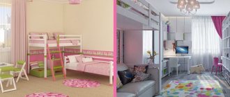
Children's room in blue tones
Types of structures
When choosing a design, it is important to take into account many nuances: find out the dimensions of the room, determine for what purpose you need a sofa. Depending on the purpose, there are two main types of structures:
- Modular. This type is good because you can choose the elements that will make up the sofa, its size and the number of seats. During use, you can change the shape of the structure as you wish, moving and combining individual elements with each other.
- Folding. This type is more compact, but no less practical. There are several types of folding structures, they are transformed in different ways. If necessary, the folding design will easily provide you with an additional sleeping place.
Both designs can be either straight or angular.
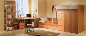
Room decoration based on the height of the child
In order to properly make a room for growth, the color of the walls must be beige. The flooring must be covered, and the furniture must be large in size.
For example, a closet or an alternative - a chest of drawers; bed or sofa. Everything that can be easily replaced should be in color, such as curtains, pillows, and so on.
Finishing ceilings, walls and floors
The decoration of walls, floors and ceilings does not depend much on the main palette, but here some nuances must be observed, especially if the design includes a gradient or another transition of shades.
For the floor, it is best to choose linoleum, ceramic tiles, or make it self-leveling. These materials are easy to clean, resistant to wear and tear, and retain their decorative appearance for a long time. Laminate is susceptible to water damage, although its surface is less contaminated than traditional wood planks or parquet. Traditional materials have a limited selection of shades, unlike modern ones, where the choice is very extensive.
The first place among finishing materials for walls is traditionally occupied by wallpaper, despite its short service life and the fact that it is easy to get dirty. Painting is considered the most practical, since painted walls can be easily washed when the need arises, and a modern living room made in white or any light colors will often require cleaning.
Stretch ceilings designed in light colors are an excellent solution for modern decoration of a living room in a modern style. They are very functional and are successfully used on uneven surfaces. Ceiling coverings of this type stretch very quickly, and the stretch ceilings themselves can have a glossy or matte surface, with or without a pattern.
Interior in green and beige
Designers recommend using a combination of beige + greenish shades to create a harmonious space in the room, close in mood to nature.
If the wooden floor of the living room is cream, the walls are dark beige, then it is better to purchase textiles - curtains, bedspreads, pillows - green. Salad, lush greens or leafy tones harmonize perfectly with cream, sand, and milk, creating the impression of freshness and airiness.
A living room in this color scheme will look original if you use greenish photo wallpaper with the overall decoration of the walls and floors in creamy beige tones.
This color combination is perfect for decorating a bedroom. In such a room, a fluffy green carpet on the parquet floor will become a color accent that does not tire or cause irritation. A few pillows, a couple of large plants in large flowerpots, perhaps a large painting - and the eco-interior will be ready.
The olive tone looks harmonious with decoration made of bamboo, beige-golden rice straw; large processed furniture made of bleached wood, matting and textured textiles will fit perfectly into such an interior.
Features of a living room in beige color
Beige color has many shades: light beige, creamy beige, peach, nut, cocoa color and many others. Each of these shades is widely used when decorating living rooms and is very popular among professional designers. Beige shades have deservedly become design classics, because it has been proven that they have a beneficial effect on the human psyche, calming his nervous system. Decorating a living room in beige has a number of advantages:
- Ease of combining this color with other shades.
- Using light shades you can visually increase the area of the room.
- This color never goes out of fashion, maintaining its relevance throughout the centuries.
- Shades of beige fit into any interior style; they are universal, but at the same time help to give the living room a zest.
- These colors look advantageous both in daylight and in artificial light.
More effectively, beige shades in the living room will be combined with colors such as brown, purple, black, green, red and gray. But the absolute classic is beige combined with brown.
What styles can a beige living room be designed in?
Due to its versatility, beige color will be appropriate in the following areas:
Classic
Here it is important to remember symmetry, conciseness and severity of lines. When choosing beige wallpaper, make the floor dark
This rule also applies to furniture; beige upholstery is best framed in dark colors. Classics do not accept diversity; choose the basic shades that will be used in decoration. Country. This style, like no other, gravitates towards naturalness. What if the color beige does not represent the natural, the natural and the natural. In a country living room, this color serves not just as a background, but it is also actively used in accessories, furniture, and textiles. It can only be diluted with brown shades, but in no case with pink, purple or red. Natural stones and dried flowers can be used as accents that will enliven the interior.
Minimalism. Beige color combined with minimalism is an ideal solution for small living rooms. A minimum of functional furniture in light shades will visually expand the room, and a few bright accents can add a certain zest to the design. Modern. A beige living room in Art Nouveau style will become a real work of art if you carefully think through the accents. Textiles, an unusual carpet or vases can become spectacular spots in a calm interior. Colors should complement each other, but it is important to achieve balance and “crush” one color with another. High tech. Despite the fact that sometimes rich colors predominate in this style: blue, red, black, white, most often preference is given to beige shades in combination with gray. It is this ensemble that is able to focus on ultra-fashionable design with modern technology. This style involves the use of glass, metal, and mirror elements, which, in combination with beige color, will make the room stylish and exclusive.
Nuances that influence the choice
They usually try to make the design of a children's room as bright as possible, using upholstered non-standard furniture. The main question remains: what color should I paint the children’s room or what color should the wallpaper be for the children’s room? There is no clear answer to these questions, since the choice will depend on many factors.
When choosing a color scheme you should consider:
- gender of the child;
- age;
- baby preferences;
- psychological characteristics of the baby.
In addition, it is important to take into account the features that relate to the room itself. In many cases, the colors already chosen for the children's room are not suitable due to the following circumstances:
- location of the children's room;
- degree of illumination of the space;
- room dimensions;
- selection of furniture.
It should be remembered that currently the original color combination is. In this way, you can create areas for the child’s various activities: a play area, a place for relaxation and learning. For each zone you need to choose the appropriate color scheme. Dividing the room into zones will help teach your child order.
From monochrome to avant-garde
If you look at the photo of a living room in a classic style, you will notice that not only the walls, ceilings and floors are made in beige tones, but also the furniture
However, if you pay attention, all items are presented in different colors. Furniture is slightly darker than walls and ceilings
And paintings and other tabletop items have dark brown and yellow frames. This style is called monochrome and involves a combination of smooth glossy and matte surfaces with convex or rough materials. This can be wallpaper with fragments of silk-screen printing on a relief background, or patterned convex furniture upholstery. The wood pattern of the flooring, the roughness of the plastered ceilings, the smoothness of the marble surfaces of the fireplace - all of this serves as a decoration for the room. Even a non-professional can complete such a simple design.
The sandy ceiling and wallpaper on the walls will come to life with floor vases and sofa cushions in bright oranges and bold yellows. With them, any room will seem warmer and more comfortable. And if you are a lover of coolness and seascapes, then the interior of the living room in beige tones can be enlivened by blue and blue additions in the form of accessories, glassware or paintings. The greenery of indoor plants will enliven a seasoned style and add a little freshness. Don’t be afraid to add other colors because of the uniqueness and conservatism of the beige tone.
All shades of red, lilac and purple can give the room a festive look. For example: lilac armchairs and a purple sofa will add a bright note to the monotonous and calm look of your room in a classic style. To visualize such a bold idea, we have placed below a photo with colorful furniture. Anyone who loves avant-garde style and originality can enjoy the designers’ ideas and turn them into reality on their own territory. It cannot be said that light furniture is suitable for a married couple with children. It is bright and dark furniture that will hide small stains that are inevitable in the presence of children and pets. The main thing is not to overdo it with colors so that the main beige background prevails. And the bright additions were not numerous.
Brown
When choosing a color to decorate a child's room, brown is the last thing that comes to mind. However, if you use brown in the form of wood, you can create a sophisticated, cozy interior. Wood in brown shades creates a feeling of security.
To prevent the interior from putting pressure on the child, add more bright and light elements.
- For a young captain, decorate a room in a nautical style, imitating the interior of a ship's cabin. Dilute brown wood with blue and white textiles.
- Boys also like the pirate style. It is useful to add gold elements, natural linen, and burlap.
- A Western room is an adventurer's dream. Scarlet splashes, leather and suede in the interior, checkered textiles and even denim are allowed.
- Do you want to instill in your child a love of nature? Choose a safari style for your children's room. Combine light sand, beige, brown shades with natural green tones, use animal prints.
- A teenage girl will love the romantic interior in country style. Use light brown shades of wood, floral prints, openwork elements and ruffles when decorating textiles.
- For a teenage boy, offer an interior in a classic English style. Details will help you feel like a real gentleman: an image of the Tower of London, a double-decker bus or a telephone booth.
Be sure to consult with your child when planning renovations in the nursery. Perhaps the baby will categorically not like the color scheme that seems most acceptable to the parents. Well, teenage children can independently develop a room project, gaining not only a stylish interior, but also the skills of a designer.
5 499
You can share or save the article for yourself:
There are no comments yet, but you can write your opinion or ask a question.
Reasons for popularity and color features
Brown sofas are very popular not only when decorating the interior of a living space, but also in offices and study spaces. The furniture has the following advantages:
- good compatibility with most styles;
- a large number of varieties, designs;
- brown furniture is produced by almost all well-known companies;
- external respectability (especially for leather models);
- creating a cozy, warm atmosphere;
- color is used in budget and luxury models;
- looks natural.
Brown color has a calming effect. There is a rich palette of shades from light brown to dark chocolate. Depending on the interior design style, sofas in the following colors are used:
- Beige-brown. It is versatile, very delicate and visually increases the space of the room.
- Taupe. Suitable for any style solution.
- Dark brown. It has strict lines and a discreet design, so it is perfect for decorating an office.
- With a reddish tint. Such furniture has an unusual appearance, so it can become the main element of the interior.
Dark brown
Beige brown
With a touch of red
Taupe
Children's room interior in red and blue colors
Red is one of the most popular shades in the world of children's clothing and toys. Take, for example, fire engines and racing cars, the Spider-Man theme, children's patterns with red apples and strawberries... The blue color helps balance a room with bright red details, makes it more suitable for a boy and is generally an ideal color combination in a children's room for two children of different sexes .
Adviсe
Some useful points that will help you choose the best combination of colors in the living room interior:
- Don't be afraid to use bright colors. Let's say you have furnished your living room in a classic design, using brown, noble beige and a little green. And everything is beautiful and dignified, but something is missing, there is a feeling of a slightly boring space. So spice up this color selection by adding unexpected pops of orange or pink. Turquoise, warm yellow and other bright contrasting shades may be suitable. Decorative pillows, wall panels, sofa upholstery and other decorative items can be made in this accent color. And you will see how the walls and furniture in the living room will sparkle, the interior will become warmer and more interesting.
- Deep blue color goes well with berry tones. Why not try decorating the walls and furniture of the living room in a blue and burgundy version with an accent, for example, in a dark green version. Only the colors should be muted, warm, natural shades, and not neon or acidic. A living room in a similar design takes on a luxurious look: the color of the walls, the upholstery of the sofa, the shade of the curtains - everything will look harmonious. At the same time, such a selection will delight with its thoughtfulness and decorativeness.
- If the living room has a strict black and white design, then you can decorate its walls with bright colors of red or yellow, or add a little green. You will see how much the interior will change after this; the living room will immediately take on a lively, warm look.
- It is better to choose warm and soft colors for wall decoration, curtain colors and sofa upholstery rather than cold ones. A living room decorated in warm colors always looks more cozy and comfortable. Beige and orange are always visually more comfortable than lilac or cool blue.
- You can try this rather bold option: paint the entire living room in light mint-sand shades. And as a contrasting tone, add dark beige, turquoise or add bright green. Such a living room will be a real source of pride for the owners and an ideal place for relaxation and meeting with friends.
- Don’t use too many details in a contrasting color - one large or two or three small ones will be enough to highlight the main decoration of the room. For example, in a grayish-beige living room, one bright red large sofa or several small pillows and a painting on the wall in a contrasting color will look great.
- The more natural the basic colors of the floor and walls, the more daring experiments with contrasting shades of curtains and sofa you can afford.
Whatever color combination you choose, do not forget to adhere to the rule of proportionality between contrasting and primary colors - and, without a doubt, even your own living room design will look great.
https://youtube.com/watch?v=_MezU8D04Uc
https://youtube.com/watch?v=3ZmwjO9eO_Y
Blue
Blue color in the interior calms and helps to concentrate. Please note that blue reduces appetite, and if there is an abundance of blue in the room, the baby may develop depression.
Advice. Psychologists recommend blue for children who lack perseverance.
Shades of blue refresh the interior and are suitable for southern sunny rooms.
White color will help reduce the negative impact of blue on the psyche. Stripes immediately come to mind - a nautical-style nursery that boys like. But white and blue can be combined differently, for example, in a classic or futuristic style.
A teenage boy will love an interior that combines blue with dark gray and black. In such a room, you need to carefully consider the lighting to avoid darkness. In a girl's room, blue can be interestingly combined with a cool pink shade.
Children's room in blue tones
Successful combinations
Walls, furniture, curtains should not be chosen in gray tones. You will need a spot of color that will enliven the interior of the room. If gray is the main one, then you can choose others in contrast. But you shouldn’t take more than 3 tones.
With white
The combination of white and gray in the bedroom is ideal as it has a relaxing effect. In a small room, more white is needed, and saturated shades are chosen from gray shades. Geometric patterns and abstractions on walls and pieces of furniture will look interesting. The emphasis on the white bed distracts from the fussy base tone. Snow-white tulle curtains and a light carpet will complement the bedroom design. You can contrast white walls with furniture in gray tones. A bed with a textile headboard will provide special warmth, and a small rug will complement it.
With pink
The severity of gray in the bedroom can be softened with pink. Pearly colors are ideal next to powdery tones. Fuchsia accents liven up the light gray walls. Here you should not overdo it with pink, otherwise sophistication will turn into excessive naivety. It is enough to include 30% of the tone of a girlish blush.
With blue
Playing with the color blue will help refresh your bedroom. Even one contrasting spot, like a blue vase, can bring out the shades of gray and ash in the room. The price of neutral furnishings will increase if you combine adjacent tones of blue and grayish.
With yellow
The color of stone and concrete makes the bedroom gloomy. And golden yellow will add light. But do not overdo it with yellow trim, otherwise the harmony of the interior will be disrupted. It is better to accentuate the textiles of the room with yellow. You can choose gray-yellow prints on walls, carpets, paintings.
With brown
Gray can be partnered with all shades of brown in the bedroom. Dark or light, they will delimit the zones of the room. If the bed is in a romantic haze, then the linen closets are made of natural dark wood. A dry interior will become warm when combined with a brownish floor. Rug patterns and picture frames will also make your bedroom feel cozy.
With blue
The gray-blue palette of the bedroom will add vigor in the morning. A cold combination is especially recommended in rooms facing southeast or south. Neutral colors relax you after an active day at work. In such an environment they relax emotionally.
Color combinations in a turquoise nursery
Turquoise color is often the predominant color when designing a children's room.
But one way or another, there are other shades in the interior. These can be pieces of furniture, textiles, souvenirs, photo frames and other accessories.
Here are the most successful combinations that will help create a harmonious place to sleep, study and play.
Successful combinations with other colors
Designers use brown tones so that they do not create a gloomy mood. Compositions with other shades are needed to create color unity in the living room.
With green
The tones of wood and foliage look organic together. In a brown living room, the colors of swamp, moss, and pistachios are appropriate. Emerald and malachite shades are used in classic interiors. Green tones give the room more freshness. You can place indoor plants on shelves and window sills in the living room. Textiles in greenish tones are used: pillows, blankets.
With blue
Rich brown colors in the room are successfully combined with sky blue. It is best if the walls are painted turquoise, ultramarine or azure. Then the flooring and furniture choose the colors of tree bark. The beige walls are in harmony with the pure blue plastic on the furniture.
With yellow
Brown shades are close to yellow and golden tones. Rich tones of yellow are used in the selection of textiles and accessories. In the chocolate living room, golden silk curtains are hung on the windows. You can experiment with the ceiling by painting it in the colors of the sun. Then there will be more space.
With gray
The combination of gray and brown is ideal for Scandinavian style. The background for the living room is white. Upholstered furniture made of natural wood can be covered with shaggy gray wool blankets or fluffy pillows. The coldness of gray is lost in the warmth of brown, giving the room a cozy feel.
Coffee with milk
Coffee color is chosen as the predominant color in the design of the living room. It harmonizes with the sandy tones of textiles and the richness of brown in furniture made of natural wood.
The interior becomes luxurious if you use chocolate-colored trim and light coffee-colored furniture. Appropriate textiles and lamps are selected for it. It is best to make the wall behind the back of the sofa a single color by choosing either a dark or light shade of wallpaper or panels. The pattern on the textiles should match the color of the wall decoration.
Violet
An interior in purple tones promotes the development of a child’s creative abilities, trains imagination, and improves memory.
You can decorate the walls with a dark shade of purple, install lilac-colored furniture, and make the ceiling white. Or, on the contrary, dark purple furniture elements will look harmonious against the background of light lilac walls.
You can zone a room using a play of shades. Let the work or play area be rich, and the relaxation area light. Purple goes well with white. Girls like the combination of purple and pink, while boys like orange and purple. Light lilac looks great next to an olive shade.
Children's room in lilac tones