What is companion wallpaper?
Companion wallpapers are two canvases that are different in color or texture, but are in harmony with each other. This method of finishing has a lot of advantages; it allows you to make the room more voluminous, hide imperfections in area or lighting, and also gives the interior individuality.
Rules for selecting companions
When choosing wallpaper companions, you should adhere to one rule. Two seemingly different types of wallpaper must be connected by something so that they look like one whole in the picture of the room. This could be texture, color scheme or pattern. It is also preferable to choose companion materials of the same thickness and manufacturer; construction stores often display different variations of wallpaper combinations on one stand, this greatly simplifies the task.
One color scheme - different pattern or texture
It is not necessary to select identical colors; similar shades of the same color, but different tones, can connect different types of companion paintings. For example, one canvas is a plain purple color with a relief texture, another with a smooth surface and a three-dimensional pattern in the form of purple flowers on a light background.
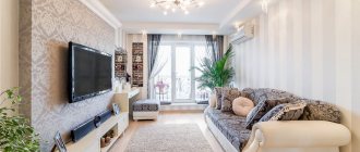
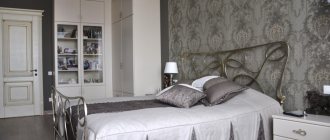
In the photo, the walls in the bedroom are decorated in the same color scheme with companion non-woven wallpaper. The coatings differ in pattern and texture.
This method of combining companion wallpaper will add volume to the room and make it visually larger.
Same texture – different pattern or color
A common texture can unite wallpaper companions; a pronounced relief will be noticeable in any color design. The selection of colors can be contrasting, for example black and white, or a softer combination.
The photo shows a spacious studio apartment. Finishing with companion wallpaper with different patterns visually divides the space into zones.
The same texture of the companions' wallpaper will imperceptibly connect different patterns; even on completely different images the same relief will be visible.
Same pattern - different texture or color
The overall pattern will combine two companion wallpapers. The image can be the same, but have a different size, for example, on one surface there is a pattern with large monograms, on the other they are the same, but smaller in size.
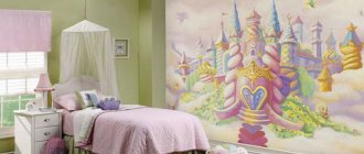
The photo shows a children's room for a girl. Wallpaper companions have different colors, but are united by theme. There are castles on both walls.
The same pattern can combine completely different colors and textures; companion wallpapers can be smooth and embossed, contrasting and calm combinations.
Different colors, textures and patterns
The most difficult design option will be a combination of completely different types of companion wallpaper, with different textures, colors and patterns. This method of companion wallpaper should be selected with care, otherwise you can end up with a tasteless interior.
The main rule is that even completely different surfaces should be in harmony with each other. The colors can be different, but at the same time be combined, for example, be pastel shades. The drawing should not be similar, but have a common theme, such as a plant one.
Wallpaper companions in the interior
When choosing complex options for combining wallpaper companions, it is better to turn to the services of professionals.
The color scheme of any room includes the colors of such basic components of the interior as:
The best option for a color scheme and, accordingly, the choice of wallpaper is a combination of 2-3 colors, since a large variety of colors has an overwhelming effect on the psyche. In addition, when choosing the color scheme of companion wallpaper, you must initially decide whether the wallpaper will be combined with each other (nuanced color scheme) or contrast. So, with a nuanced decision, wallpaper of the same pattern, but slightly different in tone, is usually chosen as companion wallpaper.
This option is well suited for combining wallpaper horizontally. As a contrasting solution, a vertical arrangement of wallpapers of contrasting color is usually chosen.
In addition to the horizontal and vertical combination of companion wallpaper, other options are possible - decorating walls with wallpaper using the “patchwork quilt” technique, appliqués, etc. Such techniques involve combining more than 3 color shades, which complicates the implementation of a harmonious color scheme.
Examples of combinations in the interior of rooms
For the hall (living room)
The living room has more interior design options than other rooms in the house. Unlike a bedroom or kitchen, a combination of companion wallpaper in bright colors and with voluminous patterns that can be united by a common theme would be appropriate in the living room.
With the help of companion wallpaper, you can highlight any area, for example, a relaxation area near the sofa and armchairs or a cozy place for reading. In addition, companion wallpaper will be a good interior solution for a living room combined with a kitchen; this method of finishing will help to designate zones, visually separating them.
For the bedroom
Companion wallpaper is a common design solution for bedrooms. This method of finishing can be used to designate a sleeping or lounge area, as well as visually enlarge the space.
The photo shows a marine-style bedroom. Companion wallpaper, like other items, has a pattern with a common theme.
With bright, contrasting companion wallpaper, you can decorate the wall above the head of the bed, thereby highlighting and decorating it.
For kitchen
Companion wallpaper will help divide the kitchen into a work area and a dining area.
Bright wallpaper can be used to decorate the entire wall of the dining area or just the part directly above the dining table. The wall above the work area can also be an accent wall. Wallpaper should be protected with transparent glass above the cooking area.
For the hallway
In Khrushchev-era and standard city apartments, the hallways are not very large; paired wallpaper companions will make this room more interesting and voluminous.
It would be more appropriate to use companion wallpaper with a light color palette; different patterns and textures will diversify a small space, and light colors will preserve the area.
For children's
Companion wallpaper is an excellent solution for a child’s room; original combinations will make the child’s room more interesting and fun. A boy's room can be decorated in a light blue tone, combined with yellow or white motifs.
For girls, wallpaper companions in delicate colors are suitable: pink, lilac, yellow. For a child’s nursery, it is better to choose a calm palette; you can decorate a teenager’s room in bolder shades.
The photo shows a children's room for a girl in the attic. The decoration is made with companion wallpaper in a light palette with pink accents.
Wallpaper for the bedroom. Wall decoration options
Traditional method
– this is covering all the wall structures of the room with the same wallpaper. In this option, rather calm products are chosen, both in ornament and in color scheme.
A combination of companion wallpaper is also used to decorate all wall structures in the bedroom: for example, two wall surfaces are decorated with trellises with a floral pattern, and the rest with striped wallpaper.
Companion trellises are wallpaper with different patterns, but in a single color palette. Or, on the contrary: with the same ornament, but in different colors. The most popular option: a combination of patterned wallpaper and monochrome wallpaper of a similar tone.
Combining wallpaper in the bedroom
is able to bring individuality to the design of a room, combining hard and soft notes, logic and carelessness, order and naturalness.
what wallpaper to choose for the bedroom
A widely known design technique today is the reproduction of a bright accent on a wall or part of it.
Often richly patterned trellises are used to highlight the wall surface behind the bed, placing emphasis on it.
It is likely that such popularity for the use of wallpaper in the bedroom appeared thanks to the population of the Scandinavian countries, namely the Swedes. Since the interior of our room, made in the Scandinavian direction, almost always includes accenting the head of the bed with wallpaper. This solution was also popular in other countries.
To reproduce an accent wall, you need to take luscious trellises with a pattern or design; at the same time, other walls of the bedroom are usually left monochromatic. The tone of such dominant wallpaper for the bedroom is supported by textiles located on the sleeping area - a cape and pillows.
Emphasis occurs either on the entire wall surface behind the bed, or only on a section of it. If only a section of the wall is finished with wallpaper, then its edges are refined using fillets, planks and slats.
It happens that wallpaper pasted on part of the wall at the head of the bed also extends to part of the ceiling. This method works well in bedrooms with low ceilings: the transition of wallpaper from a vertical wall surface to the ceiling can visually lift the room.
Color combination ideas
Beige
The calm, universal tone goes well with a variety of colors. Beige harmonizes with bright and calm, warm and cold colors. It also successfully serves as a background. The best combinations will be with wallpaper companions in white, blue, emerald, red, brown and black. Depending on the partner’s color choice, companion wallpaper will look good in the interior of any room.
White
The white tone is harmonious with any colors. The combination can be soft or contrasting, the colors rich or pastel. A combination of white and blue, red or black will look especially good. Also, the texture is clearly visible on a white background.
Gray
The gray color of the wallpaper is harmonious with clean and dusty shades. Cold and warm gray tones are suitable for interior design in a modern style. The combination with pink and purple colors will look soft and gentle. Wallpaper companions of blue, red and fuchsia are a more contrasting, but no less successful combination.
Greens
The green tone of the companion wallpaper will look good with warm natural shades, such as brown, gray, orange, cream, gold and black. Eco themes will make the interior warm and the atmosphere soothing.
Black and white
The combination of black and white already looks complete and complete, they complement each other. However, yellow, light green, orange and purple shades can be an excellent companion to black.
Purple
The beautiful purple color will go well with gray, lilac, olive and white. Purple is suitable for interior design in a modern style. A rich shade is best used as a secondary shade.
Brown
Warm chocolate shade harmonizes with blue, turquoise, green and pink. Rich colors will stand out against a brown background. The combination with companion wallpaper in cream and beige shades is suitable for decorating an interior in a classic style.
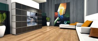
The photo shows a loft-style living room. The walls are decorated with different types of companion wallpaper, some of them with imitation brickwork, others with plaster.
Pink
Pink color can be a delicate pastel shade or a rich fuchsia color. The light version of pink is combined with turquoise, light blue, mint, white, gray, olive and brown. For a fuchsia tone, the company will be accompanied by wallpaper companions of mustard, gray, and light green colors.
Blue
Companion wallpapers in white, grey, pink and yellow go well with a delicate blue tint. Among the bright colors to combine, red, orange, and brown are suitable. Depending on the partner color, the interior will be bright and rich or calm.
Features of color selection
We initially pay attention to the color of the wallpaper. Therefore, you will have to work hard on this choice the most. To successfully complete this stage, there are several universal tips . Whether to adhere to them or not is a personal matter, but completely ignoring these provisions can negate all your efforts.
Important! Remember that if you use photo wallpaper in the interior, they should only be combined with plain background canvases, preferably neutral shades. The emphasis in the room should be on the panels; don’t try to add anything else if you don’t want to spoil the whole impression.
- If the room area is large, you can safely use wallpaper in bright, contrasting shades. However, remember that in this case the room will need to be divided into zones.
- If the room is small (kitchen, hallway), choose wallpaper in pastel, neutral shades so that the room does not create an atmosphere of overload.
- Do not forget that each color has its own characteristics, properties and affects a person in its own way:
- green: calming and inspiring. Often used in eco style. It harmonizes well with other bright wallpapers;
- lilac: moderately bright and moderately calm. Conducive to rest. Pairs well with white, silver and black;
- grey: often found in minimalism. Combines with wooden furniture. It is considered one of the most difficult colors to combine, and therefore requires special attention;
- beige and orange: create a cozy, warm atmosphere. Pairs well with classic-style furniture;
- blue: the color of calm and tranquility. It will look best in the bedroom and living room. Pairs well with white and other bright shades;
- red: a very bright and noticeable color. Creates a festive atmosphere in the room and visually expands the area. It is usually used spot-on, as a small decoration. However, not too bright shades of red can be used independently as the main color;
- white: rarely used as a primary color (except for its shades), but is widespread in the minimalist style;
- black: gives the interior depth and unusualness. Visually reduces the area. Black people are not advised to cover the entire room, although it will look great as an accent color.
Examples of design and pattern combinations
With flowers
The combination with a floral print is relevant for a classic, Provence or modern interior. The combination can be with plain wallpaper companions or with coverings with a different pattern. The color scheme for companion wallpaper should be chosen based on the shade of the floral pattern and its background.
The flower pattern is combined with smooth, plain surfaces, textured or striped wallpaper. A good finishing option would be to highlight an accent wall with companion wallpaper with flowers. For example, a three-dimensional image of roses above the head of the bed or sakura flowers above the seating area in the living room.
The photo shows a bedroom in neoclassical style. The walls are decorated with companion wallpaper in a horizontal manner.
Strip
Striped companion wallpaper can be combined with other images, patterns or textured surfaces. In addition to aesthetic pleasure, the strip visually adjusts the space of the room; depending on its direction, the room appears wider or higher.
When combined with voluminous images, companion wallpaper with stripes should choose a calm color palette that will echo the color of the picture. In combination with textured or non-patterned wallpaper, you can choose a bolder shade. In this case, companion wallpaper with a striped pattern will attract the main attention.
Under plaster
Companion wallpaper under plaster attracts attention due to its texture. The embossed surface looks harmonious with almost any type of companion wallpaper; patterns and ornaments, stripes, as well as 3D images would be appropriate.
Plaster coating in company with other wallpaper companions plays a secondary role.
Colors and styles
By varying different textures and shades, you can create any mood - from the feeling of a warm summer morning with its gentle light shades to a mysterious intimate twilight woven from deep, mesmerizing tones. Therefore, when choosing wallpaper for decorating a bedroom, in addition to quality, special attention should be paid to the presence and method of applying the pattern, as well as the overall color scheme - its depth, saturation and brightness.
Bedroom design styles in the photo
Classic style bedroom
Empire style in the bedroom interior
Bedroom in Provence style
Romanticism in the bedroom interior
When decorating a bedroom, it is not at all necessary to adhere to any one style, but it will not be superfluous to know what the highlight of each of them individually is:
- modern: compliance with fashion, no frills, versatility;
Modern bedroom in gray tones - Provence : grace, originality, abundance of shades, complexity of textures and patterns; The warmth and comfort of Provence in the bedroom interior
- loft: simplicity and naturalness, neutrality of design, calmness of color and tone;
Bedroom interior in loft style - country : rich in small details, discreet light and warm shades; Progressive country in the bedroom interior
- Japanese: conciseness, naturalness, neutrality of color and tone;
Japanese bedroom design style - classic : clarity and aristocracy, a wide range of colors and shades. Modern trends in classic style for the bedroom
Wallpaper, and especially combined wallpaper, should be harmoniously combined with the rest of the furnishings in the bedroom, in particular with the furniture. If the room is small and the bedroom set is light, the ideal solution is light (white, beige, light green, ocher, light orange, etc.) wallpaper - they will allow you to maintain a sense of spatial freedom. In larger rooms, you can play with contrast - in this case, the wallpaper is selected a little darker than the furniture. A dark set will look much better with green, brown, beige or sand wallpaper.
Warm colors should be combined with warm ones, cold ones with cold ones. Keeping this simple rule in mind, you can easily achieve consistency in color schemes in your interior.
Tips from the designer
There are a few little tricks that can help keep your room design balanced and harmonious.
- To make your design with companion wallpaper look like a single picture, you should choose a material of the same thickness and price segment. This will simplify the finishing work and will look neater. It is most convenient to choose wallpaper companions from one manufacturer.
- It is necessary to take into account color compatibility when choosing wallpaper companions. The combination can be soft or contrasting, but the colors must be combined with each other.
- The same goes for patterns. In the interior of one room, you should adhere to the same style and theme.
- When decorating the interior using the horizontal method, a larger pattern and a dark shade should be pasted in the lower part, respectively, a small pattern and a light color in the upper part.
How to glue companion wallpaper?
Pasting wallpaper companions is carried out according to the same principle as others, with the exception of several factors.
- Before starting work, you need to decide on the location of the canvases.
- When designing a strip horizontally, the companions can alternate through one, frame the wall along the edges, or have a different order. For this type of finishing, it is important that the canvases have equal thickness.
- Afterwards you need to prepare the surface. To do this, you need to clean the wall from the old coating, plaster it and prime it.
- To simplify the work and ensure a good result, you need to make markings on the first page. This will prevent the wallpaper from falling over.
- Companion wallpaper strips are being prepared. They need to be cut and arranged in the right order. The glue is applied in accordance with the requirements of the wallpaper material. The strips are glued end to end.
Photo gallery
Companion wallpaper is a great way to add personality to your interior. There are many ways to decorate a room with different types of wallpaper, different in color, texture and pattern. Depending on the chosen combination, the interior will turn out to be gentle and calm or bright with details of rich colors and patterns.
An interesting solution when creating the interior of a classic living room
The desire to create original wall decoration has no limits. Textured plasters, imitation brick or stone masonry and other techniques are, of course, very interesting, but will be quite expensive. Moreover, such techniques sometimes require special surface application skills. There is a way - using special wallpaper. Let's figure out what companion wallpaper is and learn how to use it to make your interior sparkle!
Wall decoration in the same tone, but with different prints
For those who are missing something in the interior, the option of decorating the walls in two or more colors is suitable.
Harmonious combination of a bright wall with light wallpaper
This wall design will functionally improve the room
Zoning using wall decoration
Spectacular combinations for the bedroom interior
When choosing wallpaper combinations to decorate your bedroom, you need to remember the rule of similar elements. It lies in the fact that in combination, for example, different shades of the same color, a single or similar style of ornament, overlapping geometry or a similar texture of wallpaper, etc. will always look good.
Popular combinations for bedroom interiors:
- Solid single-color wallpaper in various shades
This technique is ideal for decorating calm, discreet and mostly monochromatic interiors and is implemented by covering one or more walls, or individual sections of them, with wallpaper of a deeper color. The most commonly used combinations are blue, beige and gray.
Combining wallpaper: single tone - different shades
- Plain and patterned wallpapers
If the bedroom is decorated with bright and large patterned panels, you can balance them with plain wallpaper. This technique is also suitable if the main wallpaper has a large pattern, wide stripes or a geometric pattern.
Plain and patterned wallpaper in the bedroom
- Wallpaper with various patterns
Traditionally, combinations of striped or patterned wallpaper with similar shades and patterns are used. For example, floral patterns are ideally combined with woody ones, and geometry - with abstraction.
The combination of wallpaper with different patterns in the bedroom interior
- Wallpapers with different textures and shades
With this combination, you should adhere to the rule of smoothly combining active colors with neutral ones, simple textures and patterns with complex ones, bright and deep shades with calm and discreet ones. This technique looks great when zoning a bedroom and, by experimenting with contrast, allows you to create a truly bright and stylish interior.
Wallpaper in the bedroom: various combinations of textures and shades
Contrasting wallpaper combination in the bedroom
Combination of different textures and shades in the bedroom interior Combination of wallpaper with different textures and colors in the bedroom Textured contrast of wallpaper in the bedroom interior
The choice of patterns, textures and designs should be approached with great caution - the main thing is not to overdo it with saturation or aggressiveness of contrasts, otherwise you will not see an atmosphere of calm and relaxation in the bedroom.
What it is?
Companion wallpaper is nothing more than two options for wall decoration, which differ in several parameters. They may have different structures, colors, and patterns. But at the same time, a necessary condition is a harmonious combination of paintings with each other. Often used:
- A modest neutral background on 2-3 planes.
- A bright ornamental and catchy companion on 1-2 planes.
Note! Such finishing can be done in stripes, squares or other combinations that will look organic in the interior.
Combined wall decoration will emphasize the originality of the interior
The advantages of this type of wall decoration are obvious, including:
- Unlimited field for the designer’s imagination and the embodiment of his creative ideas.
- Such ideas will definitely not be boring and standard.
- By combining colors, textures, and styles, it will be possible to disguise the shortcomings of the room, which are most often located locally and not throughout the entire area.
- Wallpaper companions do not need to be long and painfully selected. Similar ready-made solutions in a huge number of modifications are offered in all collections of finishing material manufacturers.
- This way you can easily perform zoning.
Selecting a specific zone in a room is the key to a successful and comfortable interior.
Advice! This type of wall covering can be implemented in any room, be it a bedroom, hallway, hall, nursery - there are a lot of options.
Horizontal combination of wall coverings
Rules for selecting a pair
Although everyone is free to do whatever they want in their home, there are still certain rules that will help you organically fit such a design solution into a room of any size and purpose, regardless of the interior style. Combination options can be divided as follows:
- Common color scheme, but different textures and patterns. Such variations can be found in ready-made collections from manufacturers. The main characteristics are the presence of a background fabric of a discreet monotonous color or with a slightly noticeable pattern. In contrast to him is a bright, catchy partner of the same tone, but much more noticeable. This finishing solution is often used in the European classical style.
Unusual, attractive interior thanks to paired wallpaper
- Different in color, but similar in texture and pattern. In this case, the background paintings are calm and neutral. Decorative wallpaper is in catchy colors that are immediately noticeable. There should be more than 60% background wallpaper in the room. This solution is popular for such modern styles as eclecticism, minimalism, hi-tech.
Creative design of modern interior
- Dissimilar color, pattern and structure. This combination technique is the most original, but you won’t be able to find ready-made combination ideas, so you should rely only on your excellent taste. This option is used only by very experienced designers who have been selecting finishes for several years.
Variety of textures and shades of wall decor
Important! Using completely different wallpaper companions is not an easy task. Such a solution will look organic only if there is some disorganization in other elements of the room. This technique is appropriate in the style of pop art and eclecticism.
Extraordinary, spectacular kitsch style
Combination options
In addition to the choice of structures, colors and patterns when using companions, you should pay attention to the decoration of the walls in terms of the volume of the background canvas and the bright one. In this case there are also a few simple rules.
- One surface is decorated with a bright canvas, the other three – with a background one. This solution is often used in a children's room.
- Alternating wallpaper in stripes. They can be the same or different thicknesses.
Bright design of the main areas of the children's room
- Horizontal zoning. This technique can be found often; it involves covering the walls in the lower part with dark canvases or those that have a large pattern. On top, light wallpaper or with a small print is used. The joints should be decorated with a border or molding, since it will definitely not be possible to make it perfectly even. This technique is often used when it is necessary to visually adjust a room. So, for a room with high ceilings, a dark background can occupy 1.5-2 m from the floor, and if the ceiling is standard or low, then no more than 1 m. This solution can be found in the Provence style.
Original wall decoration in the nursery
- Inserts – this option is relatively easy to implement. After all, the first thing to do is paste the background wallpaper, and on top of it a bright companion. Moreover, the latter should be really catchy and noticeable, with a clear relief. To make the inserts look organic, they are edged with frames made of wooden slats. This solution is typical for classic interiors.
Proper combination of materials with the use of borders
- The patchwork method is original, but difficult to implement. In this case, there will be some kind of patchwork on the walls, but from wallpaper. Often, companions are placed in a checkerboard pattern to create a certain systematicity. In this case, individual elements must simultaneously be contrasting, but at the same time harmonize well with each other.
Stylish bedroom decorated in patchwork style
Note! When choosing pairs or triplets of wallpaper, it is worth considering that contrasts visually make the room smaller. Therefore, for small rooms you need to use companions with and without patterns, but not flashy combinations.
Selection rules
The choice is always made carefully, because finishing should not be equated to the realm of the banal. The bedroom should be harmonious and in a certain style.
Without fail, instructions for combining finishes involve working with the base color of the interior. As an example, consider a bedroom in which the base color is neutral. In this case, you can use any furniture, in any style and any color.
Neutral color opens up wide possibilities for choosing furniture
If the combination involves the use of finishing in several colors, then each of them should be duplicated in the interior with furniture, textiles, and accessories. Thus, a harmonious and balanced interior will be created.
Colors and patterns
Deciding on the color of the room
If we decide to cover our bedroom with several colors or different textures of wallpaper (from different materials), we first need to decide on the color scheme. For the bedroom, it is best to choose natural shades of various colors.
Read also: White bed in the bedroom: successful design solutions
For example:
- if green, then the color of grass or pistachios;
- if blue or blue, then the color of the sky, cornflowers, sea, etc.
Vertical stripes visually raise the ceiling. Wider stripes on the right wall expand the space and highlight the bed.
If the bedroom is located on the north side and there is not enough daylight, choose warm, pastel, sunny colors. You can use beige, cream, light lemon, golden pink, peach shades.
If, on the contrary, your sleeping area is very sunny, and you would rather rest in a darkened room, then you can experiment with very dark, cool shades and patterns.
The walls of the room are in warm, rich colors, with an accent at the headboard in terracotta color.
Advice! An elegant option for combining wallpaper in the bedroom is a combination of muted shades of different saturations.
The room in the colors of chocolate and coffee with milk envelops you with warmth.
Drawings on wallpaper
A pattern or pattern on wallpaper for bedroom walls sets the style of the room.
What patterns can be used:
- floristic (large and small flowers, birds);
- paisley pattern (“Turkish cucumber”);
- stripes;
- wide stripes with ornaments
- monograms;
- graphic;
- check (will help emphasize the Scottish, English style).
Pasting methods
There are three methods for wallpapering a bedroom:
- Horizontal.
- Vertical.
- Pasting with inserts.
Separately wallpapered parts can transform any bedroom
Let's look at each of them separately, because it depends on how the room will look.
When gluing horizontally, the conversation turns to a classic finishing option or a retro interior.
And here there are rules:
- Darker finishing colors are used at the bottom of the walls.
- Light colors are located closer to the center and to the ceiling.
Advice! If the room is spacious enough, then the combination can be used in reverse, placing dark tones at the top. The effect will be unusual and such combined wallpaper in the bedroom will definitely become the subject of increased attention.
- The design will need a decorated border; after all, the retro style has its own requirements.
Retro style is always ready to surprise with the beauty of its interior
- As a border, you can use wooden platbands, which are matched to an important element of furniture or interior, for example, to a door, floor, closet. There is also a rule here, because the darker the wooden border, the more necessary it is to combine it with lighter tones.
Such increased attention is paid to the decorated border because it allows you to create horizontal pasting with your own hands, graphic or lined, strict and precise. In any case, the border perfectly hides the joints of wallpaper on the bedroom walls, separates the decoration and brings aesthetic pleasure to the interior.
Advice! In a simpler version, you can use a paper border. It is not so massive, acts as a budget version, but at the same time it also separates zones on the walls of different colors.
A paper border acts not only as an option to hide the joint of wallpaper
Vertical gluing also has its own interesting points:
- The most common method is to paste one type of wallpaper on one wall.
- You can also make an “accent” wall.
Read also: Flooring in the bedroom – choosing flooring
If in the first option the interest is in the variety of patterns on each individual wall, then with accent pasting all attention is given to one wall and, as a rule, this is the wall at the head of the bed.
Here, the combined wallpaper in the bedroom design is arranged so that three walls are plain, and the fourth is bright and unusual, which will be the center of attention.
For the “central”, accent wall, wallpaper with a bright pattern, color, and ornament is selected. If not the entire wall is covered, but only part of it, you can use decorative borders, platbands, slats, and moldings.
The wall at the head is always a kind of accent in the bedroom
Advice! If the bedroom has low ceilings, then the accent wall can be placed on the ceiling, as if continuing there. This will significantly visually increase the height of the room due to such an unusual “flow”.
The third method is pasting with inserts, in which you can give free rein to your imagination and chaos, because here the design of combined wallpaper for the bedroom involves the use of various geometric shapes that are pasted onto the walls in the form of original inserts.
Let's clarify:
- The joints are covered with a baguette or a decorated border.
- Sometimes the joint may be left open if that is the interior design.
- Inserts are most often located at the head of the bed.
- You can paste over not only walls, but also parts of furniture, usually cabinet doors.
Illuminated insert above the head of the bed
Visual correction
Using this finishing technique, you can easily visually correct an irregularly shaped room. Background canvases need to be pasted on surfaces with defects, and bright ones on an ideal surface - in this case, it will be possible to divert attention from less-than-perfect planes.
If you need to make a perfect square out of a rectangular room, wallpaper with vertical stripes should be glued to long planes, and horizontal stripes to short ones. If the task is to lengthen the room, the wall opposite to the entrance should be decorated with darker wallpaper. For expansion - light pastel colors in the same place.
If you have low ceilings, then you should use a horizontal image layout. You should not use bright contrasts for small rooms, they will make it even smaller. If there is a luxurious large square, then you can safely combine even 3 companions without brightness restrictions.
Dedicated black and white wall in the interior of the office
Advice! You should not use wallpaper of different price categories from different manufacturers. Budget canvases will contrast too much with expensive ones. This combination will greatly reduce the cost of the interior, even if the color and structural combination is chosen well.
Material from one manufacturer will help to avoid dissonance in paired use
Conclusion
In modern interiors, paired wallpapers look very original and fresh. With their help, it is possible to create an original look for any, even the most standard, room. In order for companion wallpaper to look organic, you should listen to advice regarding combinations, and even better, trust in this regard a designer who has experience in creating similar projects.
Decorative wall covering for a studio apartment
Did you like the article? Follow new ideas from the world of construction, design, and useful tips in our channel. Subscribe to us in Yandex.Zen. Subscribe.
Today, a wide variety of styles are used to decorate residential premises. They allow you to create incredible finishing options, each of which has its own advantages. For example, now standard wallpapering of walls has turned into an entire art. This is due not only to their wide range, but also to the way of combining several types, differing in color and pattern, in one room at once. How to correctly use wallpaper companions in order to correctly emphasize any area of the room, choose the right color scheme and the appropriate style - we will look at this in this article.
Companion wallpapers are well-chosen wall covering options that differ in color, pattern or texture.
Black wallpaper in the interior: in what styles
Black wallpaper is often used as an accent in modern interiors a la “minimalism” and “high-tech”. In minimalism there should be a minimum of not only furniture and decor, but also color. That is, a minimalist interior is an oligochromic interior. For emphasis, neutral, two-color or monochrome wallpapers without multi-colored ornaments and patterns are usually used.
Black wallpaper, especially with silver and less often golden ornaments (or with black patterns on a silver and golden background), is used to create a mysteriously luxurious atmosphere in interiors in neo-baroque and glamor styles.
Features of choosing wallpaper companions
Before choosing this finishing method, you need to understand that companion wallpaper represents the simultaneous use of several types of coatings that differ in color, texture, texture, and pattern. But, despite this, they complement each other extremely harmoniously, creating a single holistic composition that produces a favorable aesthetic impression.
With the help of a harmonious combination of wallpaper you can hide the obvious shortcomings of the room
To ensure that the room is not overloaded with diversity and diversity, the following rules must be observed:
- When using two types of coating, one should be chosen so that it is more neutral in its texture or pattern. While the second will serve as a clear accent. It is most often dominated by a pronounced pattern, as well as additional contrasting colors.
- It is important to choose the right place for emphasis. It is necessary to take into account what the apartment is like. After all, if this is a Khrushchev building, then its area is extremely small. Therefore, it is necessary to very competently select the color saturation and size of the ornament of the 2 types of wallpaper used.
If you cover areas of walls with defects with neutral wallpaper, and highlight a flat surface with bright wallpaper, then accent wallpaper will distract attention from imperfect walls
Selecting a color palette for companion wallpapers
Color is one of the most important elements of the interior, which can influence the psycho-emotional state of a person. Therefore, when choosing wallpaper, you should remember that it is they who create the background and the overall impression of the color scheme of the space. You should adhere to such basic rules as:
- The smaller the room, the lighter the tone should be. Otherwise, a room that is too dark will not only seem psychologically oppressive, but will also visually become smaller in area.
- If you want to increase the space, at least from a perception point of view, you should use light colors. Both warm tones and cold ones, but as close to white as possible, are suitable.
- But the white color itself is not recommended for use in those rooms whose windows face the north or northeast. The fact is that the lack of natural sunlight during the daytime will give white a grayish, dirty undertone.
The same color palette, but different patterns - this combination can be found in ready-made collections offered by wallpaper manufacturers
Different colors, but the same patterns. In this case, the background wallpaper is chosen to be quite neutral, and the accent wallpaper, on the contrary, is catchy and noticeable.
Different patterns, texture and color - the most original combination of wallpaper
Two color options
But these general rules regarding color decisions are even more difficult to maintain when companion wallpaper is used. Indeed, in this case, it is necessary not only to choose the appropriate color for a certain room, but also to correctly combine at least 3-4 colors with each other.
A popular solution is to alternate canvases in stripes, the width of which can be very different.
For those who have not previously had any experience in coloristic design implementations, you should use a few basic rules that always work positively:
- Choose the main wallpaper as light as possible, without any pattern. Only some unique texture is acceptable, for example, in the form of a matting or a rough surface.
- The second type of wallpaper should basically contain the same color as the main ones. But they will differ in the pattern that complements the base.
- If you do not want to combine wallpaper of the same colors, then you need to very carefully combine them according to color. Moreover, this should not be done on small samples of paper, but only by spreading large sheets of paper and applying them to each other. The fact is that color behaves differently depending on the space it occupies.
Wallpaper color for the bedroom
Since this room must first of all have comfort, it is better to choose wallpaper for the bedroom in a color scheme that will help you quickly fall asleep and relax. Each of the selected tones can be combined in the bedroom with sand, cream, pale gray and other neutral tones.
Wallpaper color for the bedroom. Recommendations
Relax and pacify different shades of turquoise and blue in the interior
. Blue shades of dark tones can also make the room darker, which can also have a beneficial effect on the quality of sleep.
Green wallpaper for the bedroom
promote high-quality relaxation after psychological and intellectual work. This color of wallpaper is recommended for people engaged in mental work, scientists, teachers, engineers.
green bedroom
Beige and gray tones
– neutral. In general, they do not contribute to relaxation, but they are not particularly stressful either. If the room is cold and its windows face north, it would be better to take a beige-cream color. If the room is “hot”, then you should prefer gray tones, which can make the bedroom visually cooler.
From the bedroom decorated with wallpaper in chocolate shades
It will start to feel warm.
Bedroom in black
There are both pros and cons, but in general a black bedroom will help you relax. Completely black wallpaper is quite difficult to find on store shelves. More often, the manufacturer supplies black-gray, black-white, black-silver and black-gold wallpaper. Whatever the pattern of black wallpaper, you can use it to create a rather luxurious, “elite” interior. The drawing here plays a secondary role. A bedroom with black wallpaper can be dramatic or glamorous, depending on the design chosen.
monochrome bedroom
Wallpaper colors in the bedroom that should be used carefully
It is not profitable to choose scarlet and red shades of wallpaper for the bedroom - such wall surfaces will become unnerving and disturbing. It is extremely unjustified to decorate a bedroom with such wallpaper where a person who has problems falling asleep lives.
Instead of red, it is better to use shades of pink, but such a bedroom will be more feminine than shared.
Yellow wallpaper in a bedroom in bright colors is not entirely desirable, since yellow surfaces charge with vigor. But on the other hand, if you need a tone at the beginning of the day, then yellow wallpaper in the bedroom will allow you to easily cheer up and tune in to a positive wave.
Purple color is quite complex and is not particularly recommended for the bedroom, as it can inspire concern. Although, this refers rather to overly gloomy, juicy and “poisonous” shades of purple. For a bedroom, for example, a delicate lilac shade or a pale floral lavender, etc. are well suited.
Combination of wallpaper companions with interior style
There is no doubt that color is very important, but the influence of patterns and textures should not be minimized. It is they, in harmonious tandem with shade, that are able to create one or another style in the room.
An interesting combination of wallpaper in a mixed-style room
Classical
Classic style is often used in interiors. This does not mean at all that the furniture should be wooden and with carved elements. Suitable proportions and fabrics used and finishing are enough.
In classic interiors, wallpaper inserts framed by moldings are often used.
The same conditions apply to companion wallpapers, the combination of which contains:
- Pastel shades of beige and chocolate.
- A gold or silver tint is allowed as a pattern in the form of monograms or stylized flowers.
- If you want to combine a basic light background with dark shades, or the design will be made in a thick, rich chocolate or black color, then you should understand that in this case a vertical stripe or a repeating pattern in the form of small monograms behaves best.
- Bright colors are also allowed - red, green and blue, but there are a few muted shades that declare themselves to be a calm color scheme.
Modern
Modern style allows you to implement a variety of ideas in rooms.
With the help of companion wallpaper, you can highlight any zone in the interior of the room
- On a nuance - in this case the design will look minimalistic, and the combined surfaces will not contrast, but will flow smoothly into each other.
- The second version of the design is more radical and, so to speak, “sharp.” In this case, the use of both dark and bright tones is allowed. The main rule is that they should be combined with each other.
- It is better to keep the design extremely simple, so most often it consists of zigzags, circles, ovals, and wavy lines. Or vertical or horizontal stripes.
High tech
An interior in a modern style will become interesting if you use plain wallpaper in contrasting colors as a tandem pair. Such a minimalist and laconic solution perfectly reflects the essence of high-tech.
Stylish combination of dark patterned wallpaper and plain walls with paintable wallpaper
And others
A combination of wallpaper in the style of Provence, shabby chic or Swiss chalet looks great.
Spacious hall in Provence style with a harmoniously selected combination of wallpaper
In this case, creamy or milky shades are used as a base. They are complemented by a second version of wallpaper with the same background, but with small, pastel-colored flowers and twigs scattered across the field.
Selecting wallpaper pattern and texture
The pattern has a direct bearing on the design and style of the room, so you need to choose it wisely.
The purple shade visually enlarges the room.
Below are the most common designs and patterns:
- Ornament. Styles such as Provence, shabby chic and retro complement well, provided that the ornament depicts natural patterns. Geometric designs complement styles such as classic and art deco.
Light and soft colors of the wallpaper fit perfectly into the bedroom interior.
- Texture. Perfect for a strict art deco style or soft shabby chic. It is a textured wallpaper embossing. Wallpaper with a textured finish harmonizes perfectly with upholstered furniture, carpets and natural materials.
The wallpaper in the bedroom that smoothly flows onto the ceiling looks unusual.
- Flowers. Flower patterns on the wallpaper add some romance to the bedroom. Well emphasizes the vintage style. Quite a feminine pattern. For a married couple, you can combine such wallpapers with more classic and strict ones.
The brightest and most vibrant images can be placed on the wallpaper in the bedroom.
- Geometric patterns. Various stripes, checks and shapes are suitable for men's bedrooms. Combines with English style and classics. In more modern styles, such patterns are combined with others in order to highlight a specific element or wall.
Dark wallpaper sets the tone and elegance of the bedroom.
Ways to combine wallpaper companions
Looking at the wallpaper companion photo examples for the hall, it becomes clear that the room in this case becomes “alive” and original. But, before purchasing such a pair, you need to clearly understand how it will be used in a particular room. The fact is that there are several basic options for covering walls with companion wallpaper.
In a large room you can safely use three companion wallpaper options
Horizontal combination of two-color
A horizontal pasting combination is not so common. This solution is most often used for classic interiors. The lower part is an imitation of wooden panels, while wallpaper with an ornament corresponding to the style can be used on top. Separate the two parts using either a gypsum plinth or gluing a special decorative tape.
Using horizontal combination, you can visually change the height of the ceiling. For example, if the junction of the wallpapers is placed at a height of about 1 meter, the ceiling will rise, and, conversely, it will fall if the transition between the wallpaper is placed closer to the ceiling surface
But it’s worth considering another option on how to beautifully hang wallpaper in a living room in two colors – it is shown in the photo below. As you can see from the picture, this is a more non-standard approach to a horizontal combination and it is advisable to use it in modern interiors.
Original combination of wallpaper horizontally
Vertical
The vertical combination is more common among companion wallpapers. In this case, most of the room is covered from top to bottom with basic ones that have a neutral shade without a pattern or with a fine texture. And the central place is given to wallpaper with a pattern and a more pronounced color.
Vertical combination of wallpaper of the same color palette, but with different patterns
In this case, it is necessary to take into account that the accent can be the central wall located opposite the entrance or a sofa. But another combination is also allowed. For example, the corner version of the combination looks original.
An example of highlighting a relaxation area with a corner sofa with contrasting wallpaper
And others
You can combine them in different ways, depending on how complex the room is in its configuration. For example, in private homes, using two types of wallpaper, you can divide a large room into guest and dining areas. In this case, wallpapers of different types occupy approximately the same areas.
The patchwork method of combining wallpaper is interesting, but quite difficult to implement
In principle, nothing limits the options for gluing two types of wallpaper in the room, as can be seen in the selection of photos presented below.
A combination of white wallpaper with different textures in a small room
In a combination of canvases with a three-dimensional pattern, striped wallpaper will attract attention
Beige wallpaper combines well with many colors
Wallpaper with a small gray print goes harmoniously with plain walls
Visual effects
Horizontal arrangement of wallpaper
If the living space is small, then it is better to combine finishing materials horizontally (and it is advisable to choose a light shade for the upper part). This technique creates the appearance of increased space.
Read also: Selection of wallpaper for the bedroom: basic recommendations and tips
This type of combination is considered classic, especially if the top is light and the bottom is dark. Also used in country and baroque styles. The upper and lower parts are separated from each other by a decorative element (border, molding), matching the shades of wallpaper or furniture.
An option for combining wallpaper for a spacious room in the Baroque style. The horizon line is 1/3 of the wall height.
This technique is also used in cases where it is necessary to visually lower or raise the ceiling. If, 2/3 of the height of the room, the upper part is covered with wallpaper with horizontal stripes, and the lower part with plain wallpaper, then the external height of the room will decrease. If at the same height the upper part is light and the lower part is darker, then the ceiling will visually rise.
An excellent option for a small room with a high ceiling -
Provence style.
Advice! If you like a narrow stripe pattern, choose wallpaper in non-contrasting colors; if you like contrast, choose a wide stripe. Wide stripes of pastel colors are especially soothing. The choice is yours. But some people prefer to be more dynamic.
A creative bedroom in a minimalist style with an accent on the walls in bright contrasting stripes - a dynamic pattern.
Vertical arrangement of wallpaper
This arrangement in combination is suitable for bedrooms with low ceilings. The width of the stripes and their alternation determines how much the space will visually expand.
Vertical stripes highlight the bed area and the nightstand area.
Another option is a strip of wallpaper with a dynamic pattern, equal to the width of the bed, which extends to the ceiling. This technique allows you to “raise” the ceiling and highlight the bed area.
Bedroom in warm colors. An unusual solution - a vertical finish equal to the width of the bed, with horizontal stripes - an emphasis on the sleeping area.
Accent wall
Nowadays it is very popular to focus on one wall with bright colors with a dynamic pattern at the head of the bed. Other walls should be made plain to match the patterned wallpaper.
Photo wallpaper in the bedroom.
Different walls
You can combine plain wallpapers of different colors (on different walls); plain and with a pattern; large patterns - small patterns. This way you can slightly adjust the space - expand or narrow it.
For example, if the room is elongated, then you can change its proportions by making short walls darker and long walls lighter.
The easiest way is to combine large and small patterns on different walls from the same collection.
Inserts
Wallpaper inserts help create the integrity of the interior or can be used to accentuate a bed or dressing table, bedroom bedside table, etc. Inserts can be of various shapes and highlighted around the perimeter with a border or molding.
A combination of striped wallpaper and a Provence style floral insert at the headboard.
Contrast in zoning
When choosing colors, you must remember that the main wallpaper should be a shade lighter than those offered as an accent. This will create contrast in the bedroom.
Contrast always emphasizes a certain area in the room. Especially when it comes to vertical combination. Every time an accent appears, it instantly divides the room, creating unique zones.
As already mentioned, financial combination can be used as an option in which the price of all wallpaper will be lower, since it may just be leftovers. But even in this case, it is necessary to adhere to a certain style in which the bedroom is designed. (See also the article Bedroom interior in a classic style: features.)
Different wallpapers correspond to the same interior style
Manufacturing materials
Finishing materials are selected with the same consideration as for the mono version. The fact is that in this case they rely more on individual preferences, the desire to obtain a highly environmentally friendly space and a certain design style.
- Paper ones are quite comfortable in terms of hygroscopicity and air permeability. It is advisable to use them in children's bedrooms, as they do not emit any toxic elements.
- Vinyls have proven to be quite good in terms of operation and gluing to walls. The stores offer a wide assortment that allows you to realize any idea.
In addition, today you can find other materials used in the manufacture of such material for wall decoration. These can be either synthetic fibers, acrylics, or the most natural ones, for example, bamboo.
When choosing a combination, you should not buy wallpaper from different price categories - budget canvases may contrast too much with expensive ones